To help us provide you with free impartial advice, we may earn a commission if you buy through links on our site. Learn more
- iOS 7.1 USER INTERFACE
- iOS 7.1 CONTROL CENTRE
- iOS 7.1 NOTIFICATION CENTRE
- iOS 7.1 GESTURES
- iOS 7.1 SPOTLIGHT
- iOS 7.1 MAPS
- iOS 7.1 LOCK SCREEN
- iOS 7.1 TASK SWITCHER
- iOS 7 APP STORE
- iOS 7 CALENDAR
- iOS 7.1 CAMERA
- iOS 7.1 PHOTOS
- iOS 7.1 MUSIC
- iOS 7.1 AIR DROP
- iOS 7.1 SAFARI
- iOS 7.1 FIND MY iPHONE
- iOS 7.1 DEVICE RESTRICTIONS
- iOS 7.1 CONCLUSION








When it first came out, iOS was truly a revolutionary operating system. In recent years, though, it hasn’t really changed much, with iOS 6 more of a tweak. Finally, with iOS 7, announced with the iPhone 5S, we’ve got something newer and altogether more modern. Since we wrote this review, Apple has further tweaked and updated the OS, with iOS 7.1. We’ve updated this review to reflect this upgrade, as it’s one that all iOS 7 users should make.
One of the key things about the point release, is that iOS 7.1 is more stable than the previous version of the OS. In particular it stops the UI crashing, where your phone locks up, shows the white boot screen and restarts the user interface, leaving your applications untouched. It also improves TouchID and makes a few needed interface tweaks, which we’ll mention where relevant.
As with previous updates, iOS 7.1 is available as a free upgrade for phones upwards from the iPhone 4, and iPads upwards from the iPad 2. Of course, performance and available features differs by device (see Restrictions later on for the full information).
iOS 7.1 USER INTERFACE
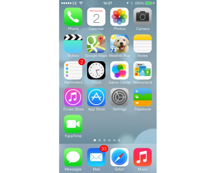
At a first glance, iOS 7.1 isn’t that much of a departure from previous versions of the mobile operating system. The home screens are still made up of small square icons that you tap to launch an app. Aside from the calendar app now showing the current date and the clock showing the current time, these icons are static, bar the ability to show an unread notification count. For example, the Mail icon will show you how many unread messages you have in your email accounts.
There are no Android-style widgets on display, which is a shame in some ways, but we kind of understand why not. People are familiar with iOS, so making too many changes, particularly to the main interface is bound to cause some confusion. What we get instead are changes to the look and feel, with the bulk of the updates sitting below the surface.
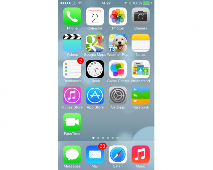
While we’ll get on to these changes soon, the change to the look is rather radical. Now the design is flatter, with the complicated icons of old gone and replaced by cleaner, simpler designs. This theme is replicated throughout Apple’s apps, giving the OS a much more modern and cleaner feel.
It’s clever, too, with the colours of folders changing to match the predominant shade of your background picture. It’s a togetherness and blending that helps make the OS feel that bit more cohesive. With iOS 7.1 Apple has further tweaked the interface to give it a more uniform look. Most noticeable are the Slide to power off screen, which now puts the slider in a lozenge, rather than a square. The phone app now has round Call and Hang-up buttons, plus a lozenge Slide to answer bar. OK, so it’s not a massive change, but it’s nice to have the consistency and this style better matches the other interface changes.
While the look’s the thing that’s most noticeable, it’s the changes under the surface that really iOS different and, in our opinion, much better.
iOS 7.1 CONTROL CENTRE
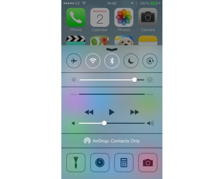
One of our biggest bugbears with iOS was that you had to go in Settings to make even the simplest change. For example, you couldn’t turn off Wi-Fi or go into Airplane mode without delving through Settings. While these options are still in there, the new Control Centre gives you straight up access to common features, all through a menu that you swipe up from the bottom of the screen. The best thing is that Control Centre is available from any screen or app, although you can disable it on apps if you prefer.
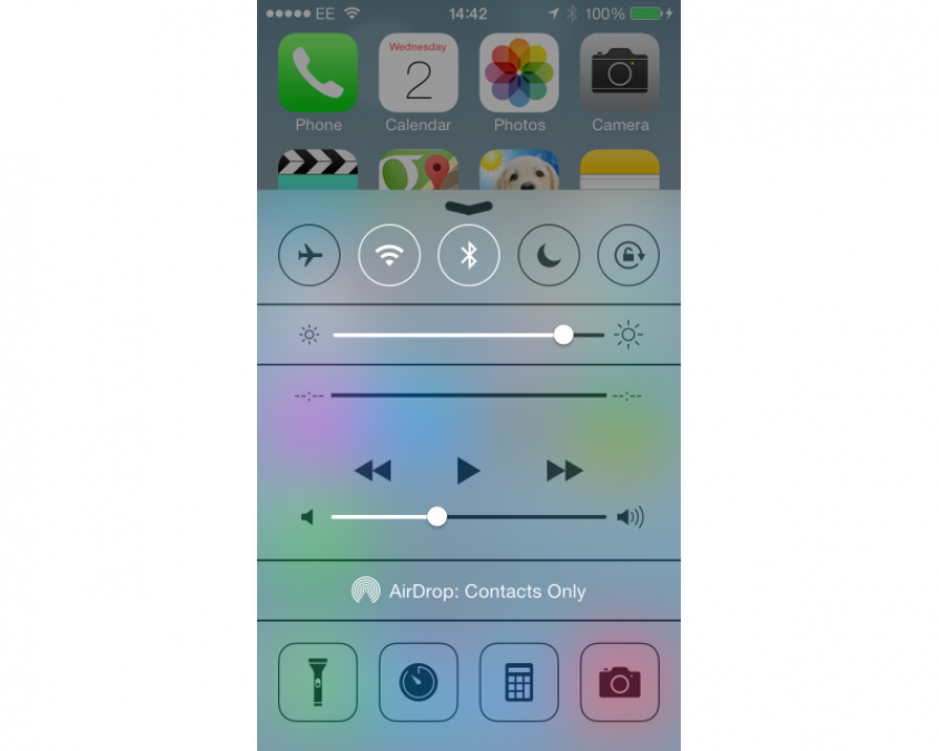
The menu lets you adjust screen brightness, toggle Airplane mode, Wi-Fi, Bluetooth, Do Not Disturb and the rotation lock. It also lets you control playback of the current media, plus it has shortcut icons for common utilities: flashlight, stopwatch, calculator (not on the iPad, as this doesn’t have a calculator app) and the camera. It’s truly a brilliant addition to the operating system and has saved us a ton of time already.
The implementation is neat, too. On the homescreen a simple swipe up brings up Control Centre; on an app, a swipe brings up a small tab that you have to tap and drag up to open the menu. This means that if you’re playing a game, for example, a wrong press won’t bring up the menu and distract you.
iOS 7.1 NOTIFICATION CENTRE
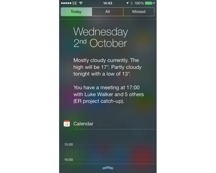
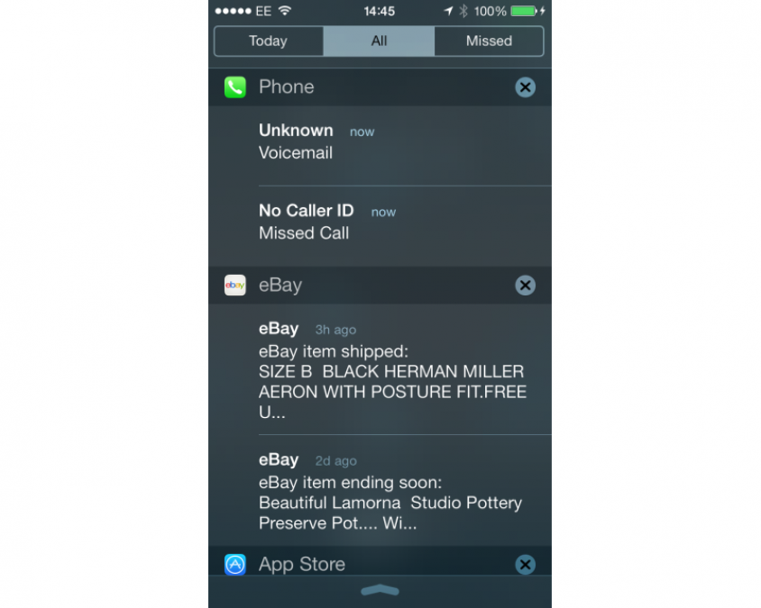
Notification Centre, the pull down menu from the top of the screen, was introduced with iOS 6, but it’s been updated for iOS 7. First is the new Today tab, which shows you your upcoming appointments for the day, with calendar snippet showing you your next meetings.

There’s also an All tab to view all notifications, such as which apps were updated and new Twitter followers. Then, there’s the Missed tab, which lets you see notifications for events you’ve missed, such as a missed call or a new voicemail message. Just tap any notification to be taken to the originating app, so you can deal with it or get more information.
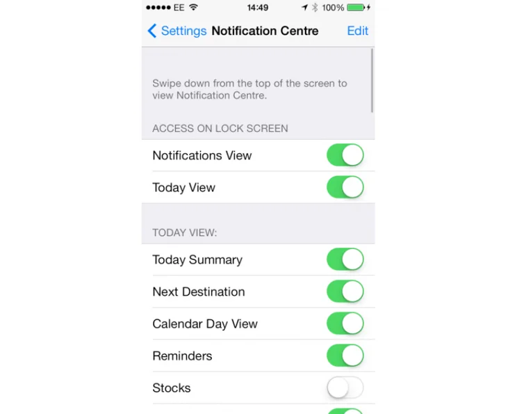
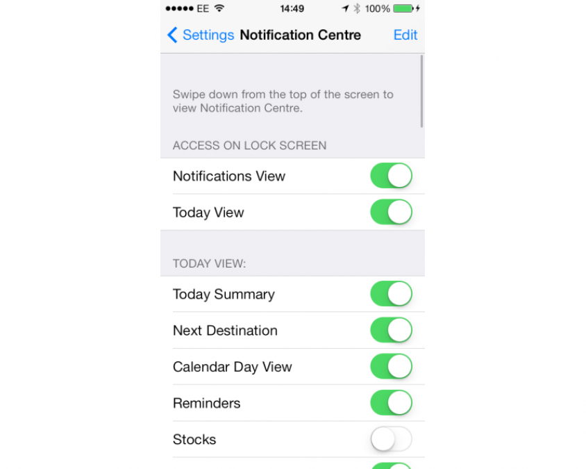
You can use the Notification Centre app in Settings to choose which notifications you’re shown and how they appear, so you can mute an app if you find it too verbose. Again, this update means you’ve got access to more information at your fingertips, without having to hunt through a load of menus.
iOS 7.1 GESTURES
New gestures have been added into the mix, so you can use the OS without having to resort for a physical or onscreen button so often. Backwards and forwards swipes are the big addition for applications that support it. These allow you to swipe from the left to go back and from the right to go forwards.
For example, in Safari in back swipe lets you go back a page, while a forwards swipe lets you go forwards a page. Generally speaking, the back swipe is the better supported action. For example, in Facebook you can swipe back from a specific post to view your News Feed, but you can can’t then swipe forwards to go back to the post.
The start of the app is the limiting factor when moving back, so you’ll never be thrown back to the home screen or to a completely unrelated app. Once you get used to these new gestures they do make the OS a lot easier and more intuitive to use.
iOS 7.1 SPOTLIGHT
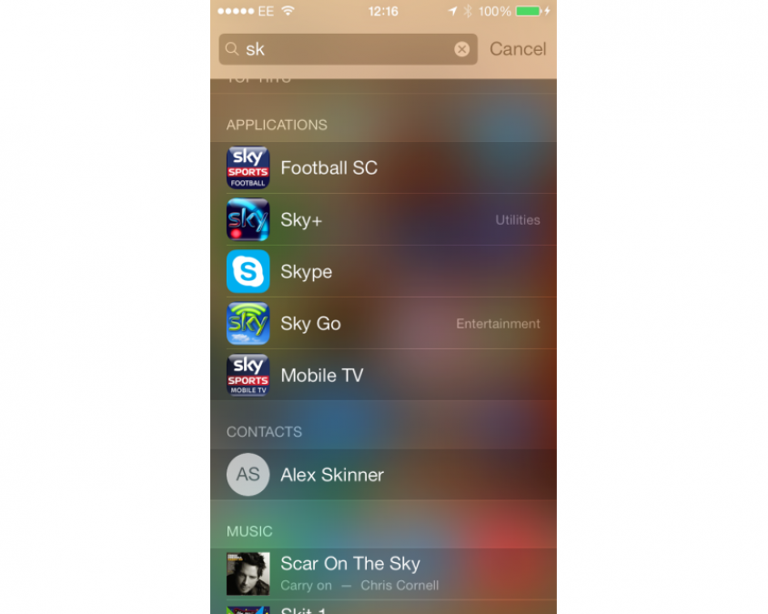
Spotlight, the method for searching your iOS device, has now moved. Rather than sitting to the left of all the home screens, it’s now accessible from any home screen by swiping down on any icon. It works in the same way, searching your phone’s content, including messages, emails, apps and music amongst others, for your keywords. It no longer searches the internet. From our point of view that’s not a problem, although we know that some people loved this feature.
iOS 7.1 MAPS
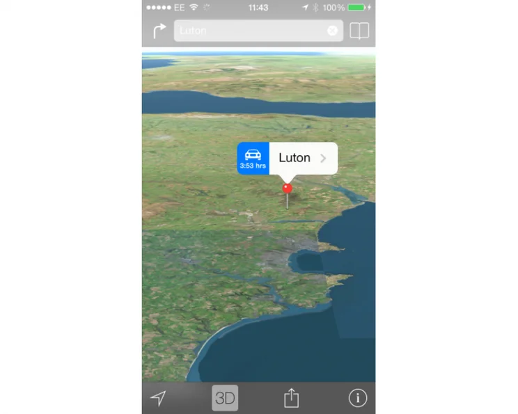
Maps was one of the big problems with iOS 6, with the new service failing to find a lot of places, having spelling mistakes and generally not keeping up with Google Maps. In iOS 7 it still has its fair share of problems. Search for Luton when in London, for example, and it doesn’t give you the town close by with its own rather substantial airport, but Luton in Devon, which is a small village. The mapping information really needs to improve, although if you enter postcodes rather than keywords, it’s a lot more accurate.

Apple has done a good job with the interface and it’s fast and responsive to use. If you’ve got an iPhone 5S, you get the benefit that the phone can detect when you’ve stopped driving and switch the directions to walking ones instead.
Apple Maps used to be the Achilles heel of the OS and, while it still needs a lot of improvement, the fact that Google Maps is available as its own app, means it’s not the problem that it once was.
iOS 7.1 LOCK SCREEN
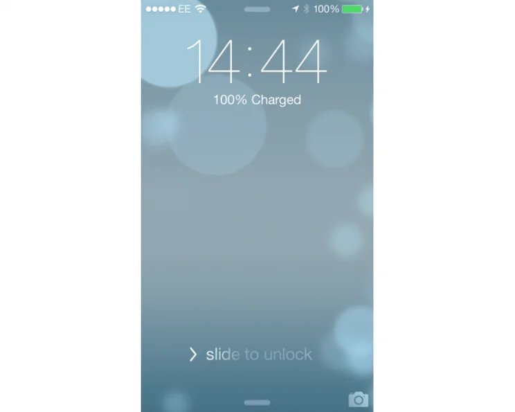
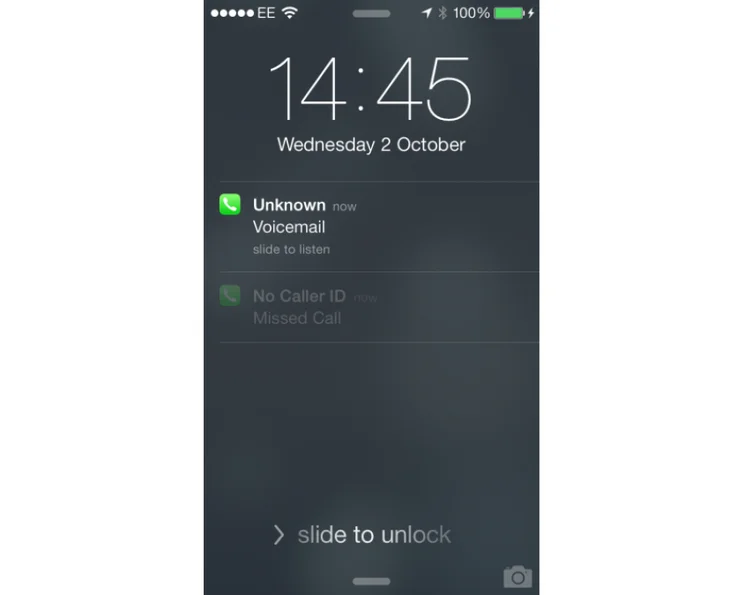
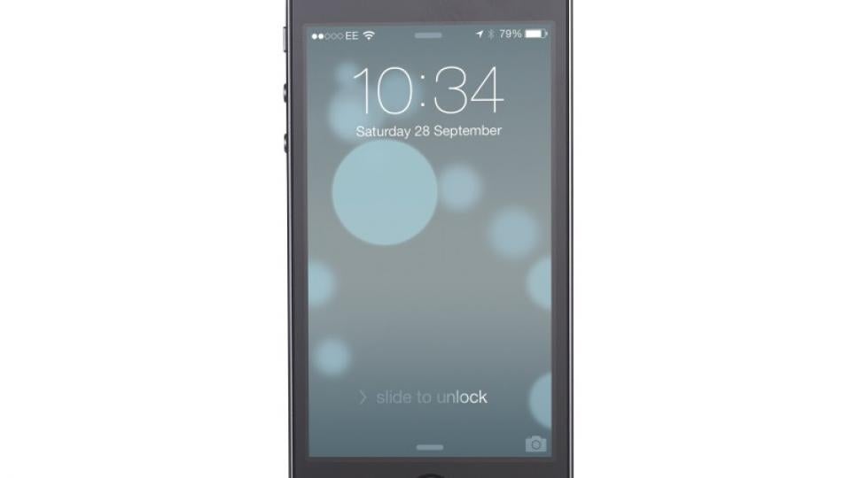
Apple has updated the lock screen and you can now access Control Centre and Notification Centre while your phone is locked. Both can be disabled if you’d rather keep all information private. You can also choose which applications are allowed to display notifications on your Lock Screen.
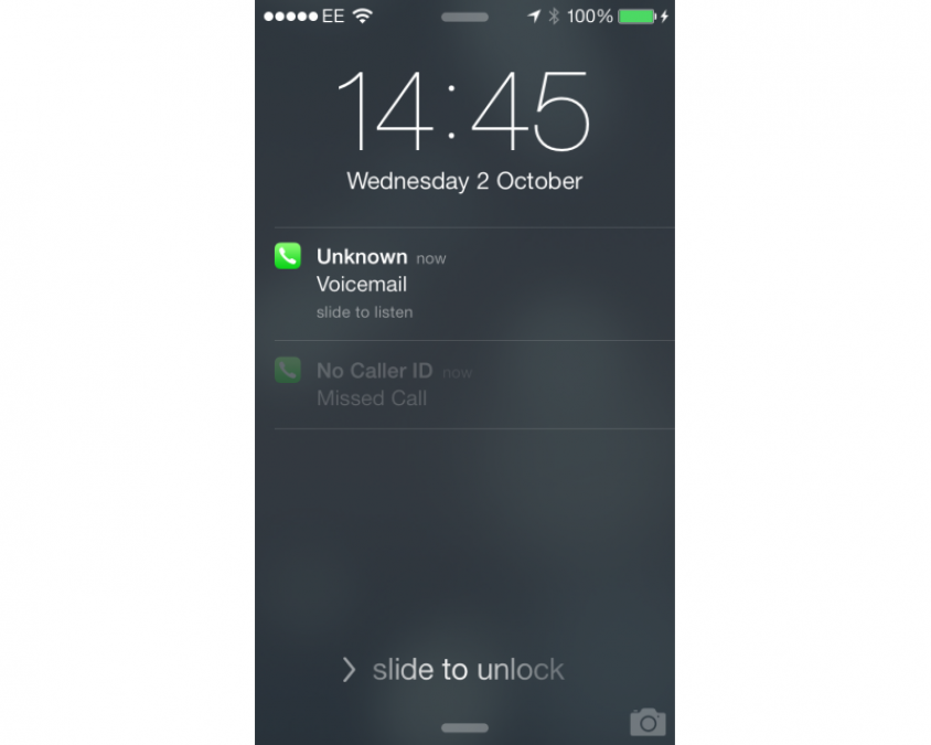
What’s particularly neat, is that you can swipe on a notification and you’ll be taken to the originating app when you’ve entered your phone’s passcode. It’s a little tweak but one that we’ve found saves a fair bit of time and lets you get the important information faster.
We like the Camera icon (bottom right), which lets you launch the camera app, so you can start taking photos without having to unlock your phone. For privacy, only photos you’ve taken in that session can be viewed, leaving the rest of your photo roll unavailable until the phone’s unlocked. With iOS 7.1, Apple has made the lock screen a little bit brighter, but that’s the only change you get.
iOS 7.1 TASK SWITCHER
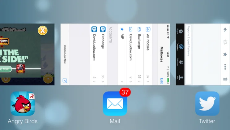
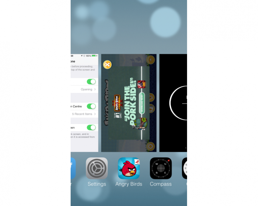
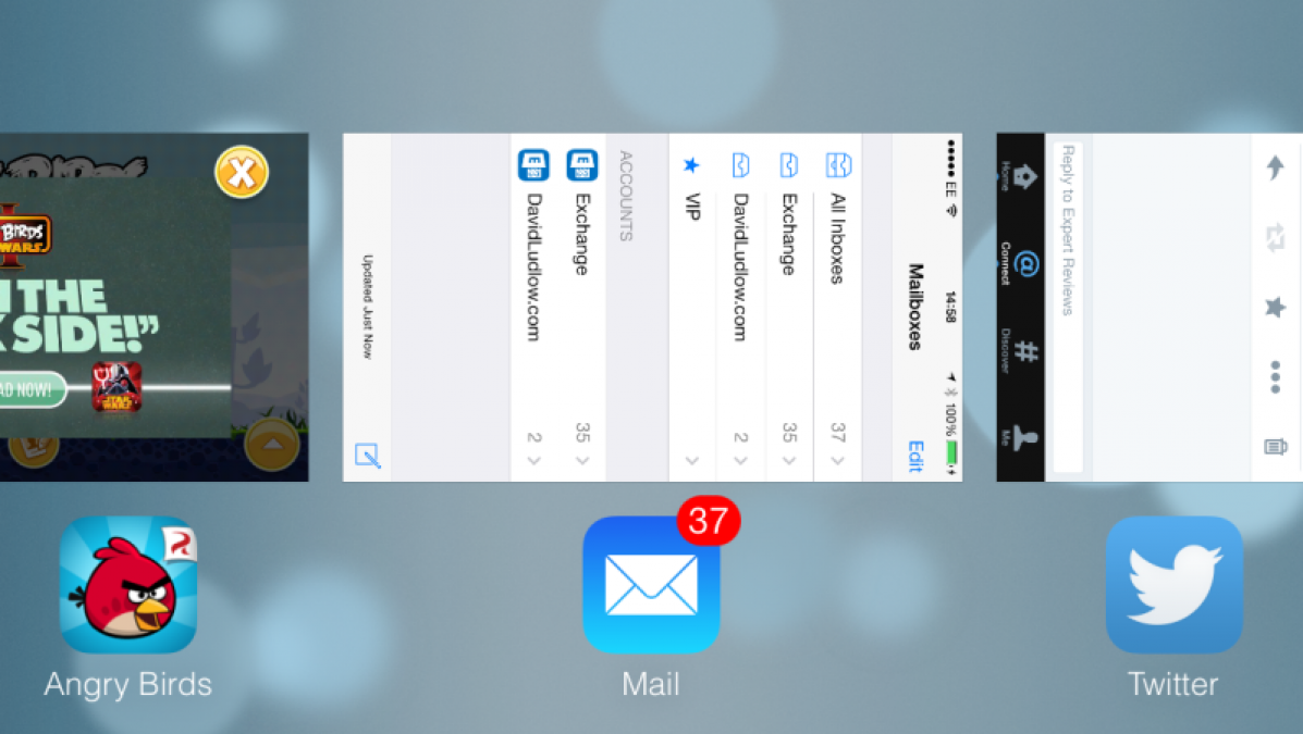
The old task switcher was a little basic to say the least, with just a small row of icons at the bottom of the screen. The new task switcher is vastly improved, with thumbnail previews of your open applications. Previews are actually live, so you can, for example, see the camera view on the Camera app. Shutting down a misbehaving app is a simple matter of swiping up on the thumbnail to fire it off the screen.
Our one minor complaint is that the task switcher doesn’t move from landscape to portrait view while it’s open, even though it matches the phone’s orientation when you first launch it. In landscape mode on the iPhone, it looks a little strange, as thumbnails can only appear in the orientation that their app supports. For example, Safari and games look correct, but Mail appears to be on its side. It’s better on the iPad by virtue of more apps being written for both portrait and landscape orientations; however, we’d expect the switcher to be a little smarter in its appearance.
Multitasking has also been improved, with intelligent background updating of apps. The OS learns when you do things, such as checking Facebook, then schedules an update so that when you open the app, it’s updated and ready for you to use.
iOS 7 APP STORE
No more messing around updating apps manually, as the new App Store will background update apps for you. It waits until your phone’s not being used for a bit, then it does all of the hard work in the background for you. You’ll get a message in Notification Centre to let you know that apps have been updated, but otherwise it’s refreshingly hassle-free.
Apple has also added a new Near Me mode, which uses your location to suggest relevant apps. For example, if you’re standing outside of museum, it can recommend related apps. We couldn’t find a lot of apps in our tests, but this kind of feature will take a while to populate.
iOS 7 CALENDAR
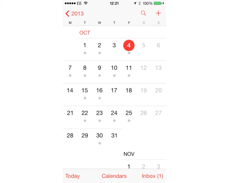
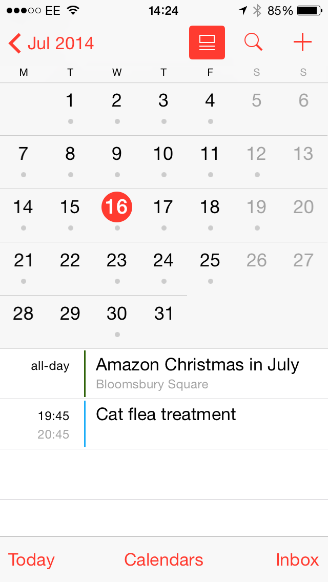
The Calendar app has had an overhaul, going with Apple’s new flatter design. From an initial inspection it certainly looks a lot nicer, and it’s definitely got a cleaner interface. With iOS 7, it was a little annoying that the month view no longer listed appointments you had for that day. Instead, you just got a grey dot showing you that there were appointments, forcing you to tap the day to go into Day view, in order to see what you had on.
Apple clearly thought the same, and has updated the calendar app. Now there’s a button (shown below) that toggles a list view. When you tap any date on the month view, the list view shows you what’s going on, without having to switch between views. It’s a massive improvement over the original version and gets rid of that little niggle with iOS 7.
iOS 7.1 CAMERA
Apple has added some new modes to its camera app for still photos. First, is Square mode, which takes square photos, rather than the usual rectangular pictures. This is merely a crop of the camera’s sensor and it’s a non-destructive edit: copy photos off the phone using a USB cable and you’ll get the full-size images.
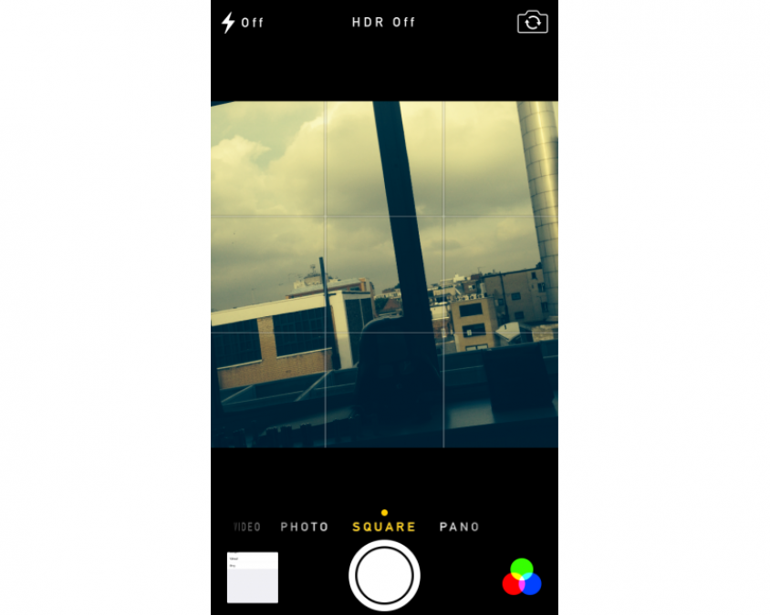
Filters can be used on square and regular still photos and include Instagram-style effects, such as black and white, and a mode to make your pictures look like they’re older. Filters can also be applied to pictures after they’re taken.
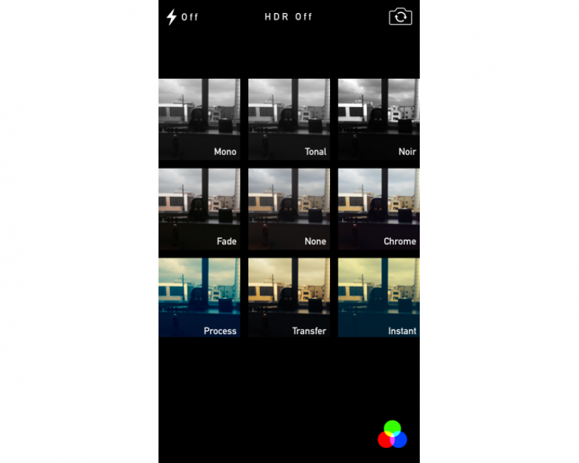
All Filters are non-destructive, so you can recover the original photo if you like, by later removing the filter. Copying photos off the phone using a USB cable will only retrieve the original image. There are a few strange results at the moment with iCloud. A photo taken with a filter appears correctly on other iOS devices in the iCloud Photo Stream; however, pictures lose their filters when viewed in iPhoto on the Mac and iCloud Photos on the PC. At the moment, if you want to keep a copy of your photos on your computer and you want to keep the filters that you’ve applied, you’ll need to email yourself a copy of the pictures you want to keep.
iOS 7.1 PHOTOS
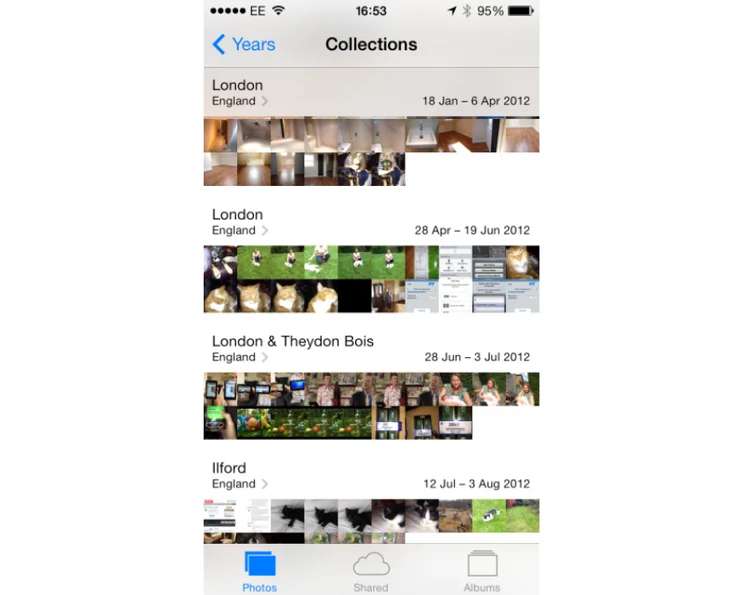
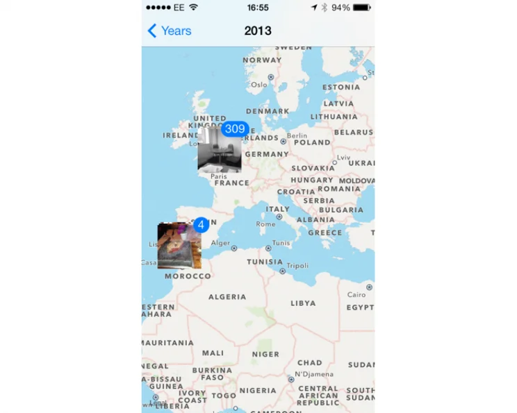
The Photos app has been significantly changed, and it’s a big improvement. While you can still view your camera roll as a big list, the new Photos tab gives you a smarter way to view pictures. In this mode pictures are sorted by year, with a sub category that shows you some of the locations of where the photos were taken. Tap the locations heading and you’re taken to a world map, so you can browse photos by location. It’s a great way to quickly pull up some holiday snaps.

Tap a year and you’ll see that photos are grouped automatically into date ranges, also sub categorised by location. You can either tap a date range to view those photos by day, or tap the location heading to have them sorted by the location they were taken at.

It means that your photos are automatically sorted in an easy and useful way, without having to manually add them all to albums. However, there’s still the option to create your own albums if you do want to take the manual route.
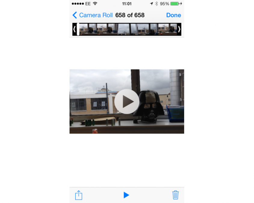
We also like the way that video editing is available right there. When you browse to a video, the film strip appears at the top of the screen. You can use this to skip to the point you want in the video, or grab either end of the strip to quickly trim the video.
iOS 7.1 MUSIC
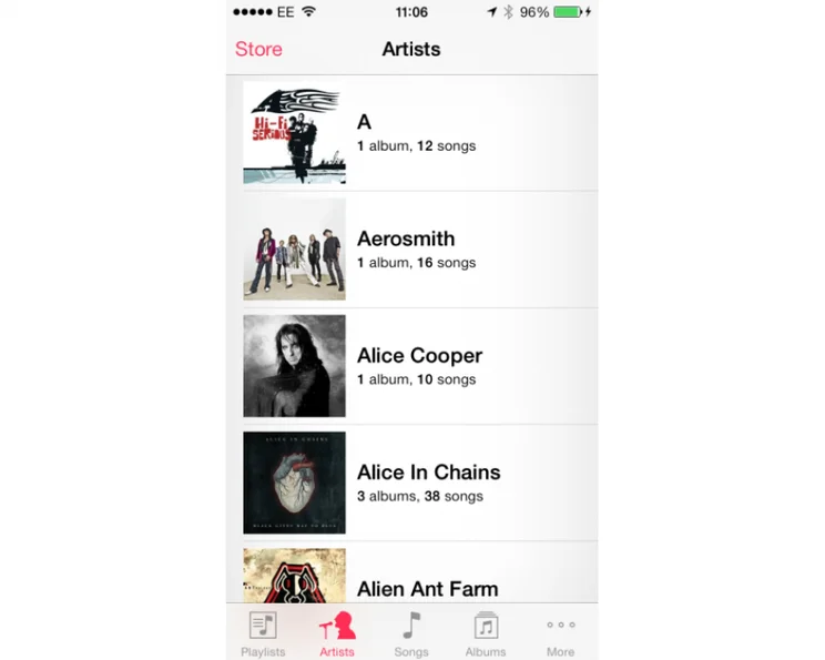
Music has had a minor update. We like the way that the Artist view now shows an image of the artist, if available, rather than just picking a random album cover. It’s a neat little touch, although it didn’t manage to fill in our entire album collection. We also like the way that it shows you how many albums and songs you have for each artist.
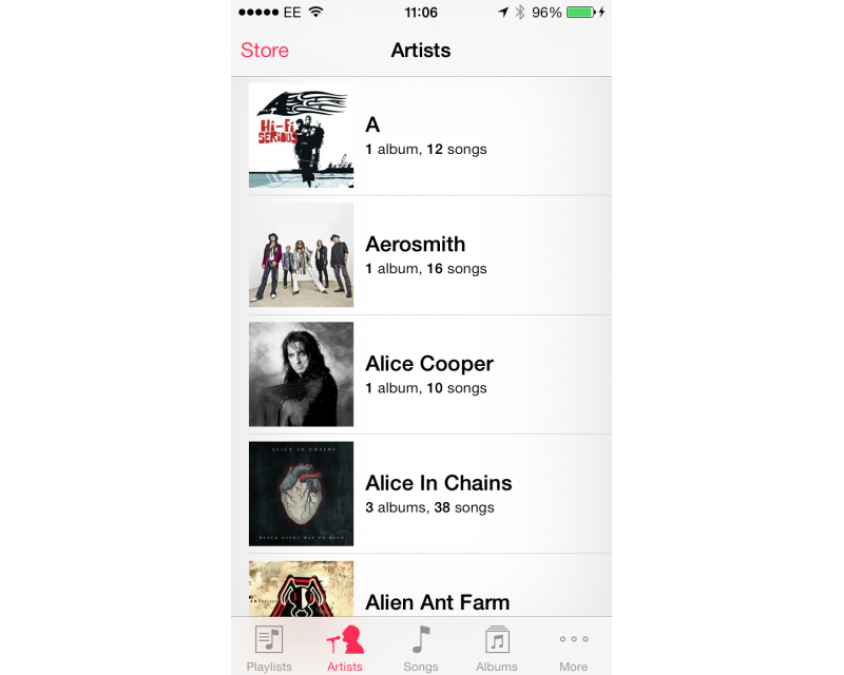
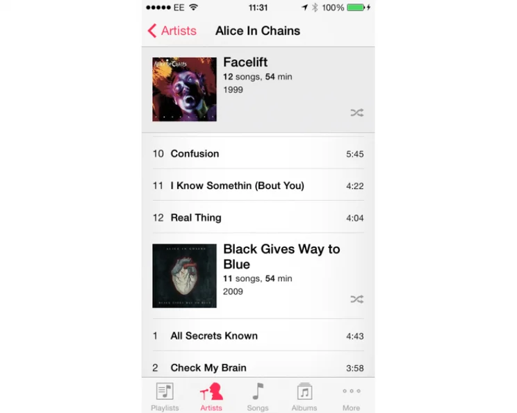
We’re not such fans of what happens when you tap an artist, though. This gives you a list of all songs by that artist, sorted by album. This means if you’ve got an lot of albums by one artist, you have to scroll through a massive list to find the one you want. With previous versions of iOS, you just got a list of albums and tapping one gave you its list of tracks.

Coverflow has gone, replaced by a grid of albums that does the same thing. It’s a little easier to use, as you get more on screen at once.
iOS 7.1 AIR DROP
Air Drop is Apple’s new way of sharing files and links with other iOS users and it’s brilliant. It uses a combination of Bluetooth to discover other Air Drop users and Wi-Fi for fast transfers, but is completely seamless in use. All you do is tap the share icon in an app to share a file or link, tap the user or users in range that you want to share with and you’re off. Transfers are incredibly quick and it is much easier than using NFC and awkwardly tapping your phone against someone else’s handset.
For security you can turn Air Drop off or make it so that only your contacts can see you, or everyone can see you. With these options you can make sure that you don’t get spammed by incoming links and pictures from nearby people.
iOS 7.1 SAFARI
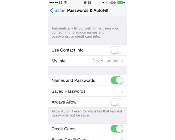
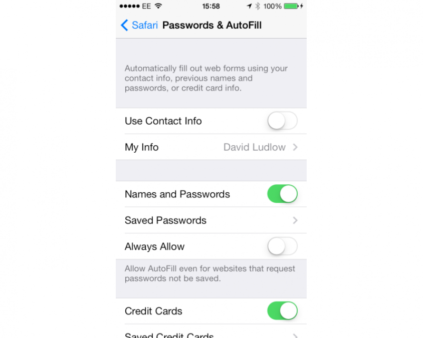
Safari has had a complete overview, with new gestures to make it swifter to navigate, although the old back and forwards buttons are still accessible. It also has better synchronisation across desktop and mobile. With iOS 6 we saw iCloud tabs, so you can see what tabs are open on your other devices; this time you get iCloud Keychain, so any account names, passwords and credit cards saved on one iOS 7 are synched to the others. It’s a feature that’s coming to the Mac, too, with OS X Mavericks, due out later in the year.
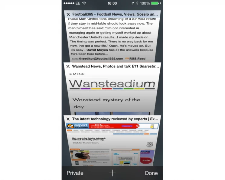
The tab switcher is now a carousel, which makes it a bit quicker to switch between tabs. More importantly, this view also lets you tap a button to go into the Private browsing mode, where your browsing is temporarily not tracked. With iOS 6 and before, entering Private mode meant going into Settings, Safari and turning it on there. It’s just another way that important settings are up-front, saving time delving through menus.

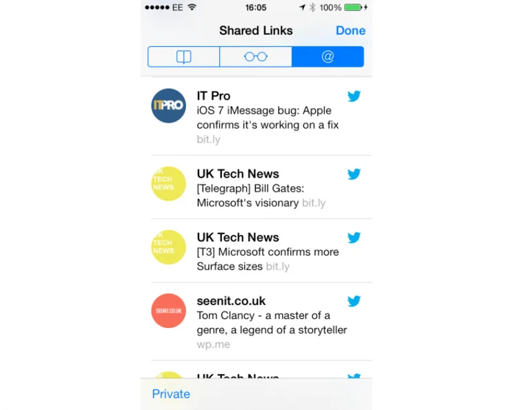
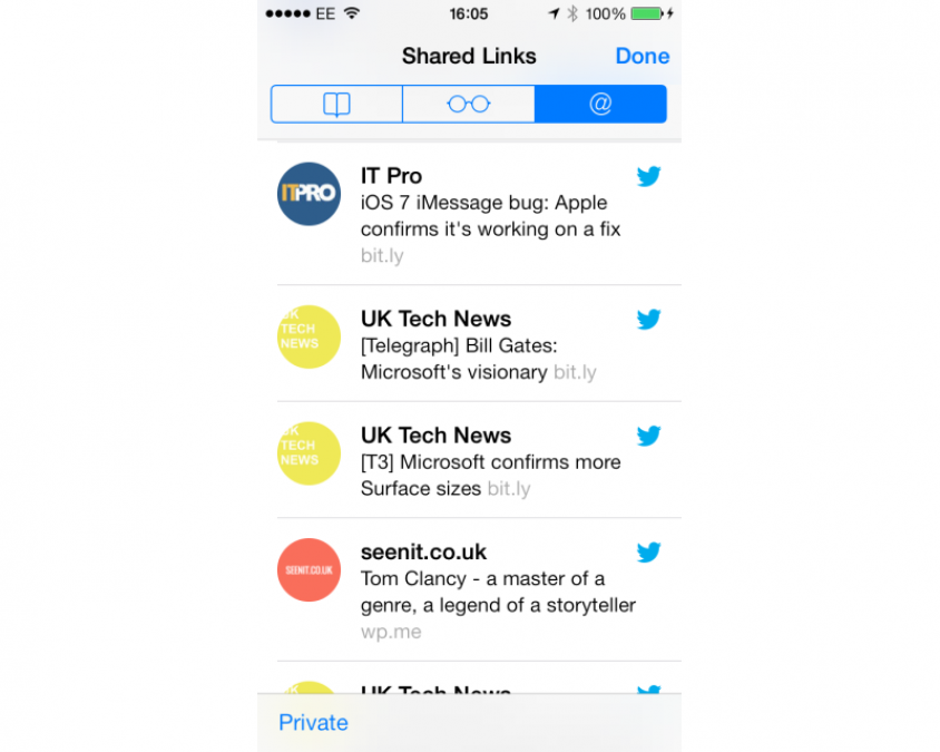
Shared links is a new addition, which pulls in links from people you follow on Twitter, along with the messages. There’s no filtering, so it’s just a raw dump of tweets with links in them, so we don’t think it’s particularly easier or more convenient than using the full Twitter app.
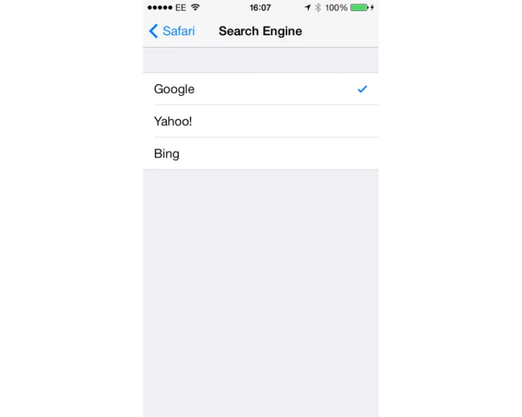
Finally, the search box is gone, replaced by a single unified box that can take addresses or searches. While Siri has opted to use Bing for its search engine, you can override Safari and pick Google instead.
iOS 7.1 FIND MY iPHONE
Find My iPhone and Find My iPad are brilliant tools to help you track down a lost or stolen device. However, the option could be turned off if your phone’s lock screen was bypassed. With iOS 7, turning off the service requires your Apple ID and Password to be entered, making it even more secure. Activating the device requires your Apple ID and password, too, effectively helping make stolen devices useless to thieves.
iOS 7.1 DEVICE RESTRICTIONS
Not all of the features are available on all device. Panoramas can only be used on the iPhone 5S or later and iPod Touch 5th generation.
Square formats are limited to iPhone 4 or later, iPad 3 and later, iPad Mini and iPod Touch 5th generation. Filters in camera are for the iPhone 5 and later, and iPod touch 5th generation. Filters in Photos are available for iPhone 4 or later, iPad 3 and later, iPad Mini and iPod Touch 5th generation.
AirDrop is available for the iPhone 5 or later, iPad 4, iPad Mini and iPod Touch 5th generation.
The iPhone 5S also gets the Slo-Mo video mode and some custom features based on its M7 motion coprocessor. You can find out about these in our full review.
iOS 7.1 CONCLUSION
Generally speaking, although it takes a while to get used to, iOS 7.1 is a big improvement over iOS 6. It’s cleaner, slicker and generally stops you having to delve through menus and settings to make simple changes. Aside from a few niggles, it’s a far superior OS.
Upgrading to iOS 7.1 really depends on the device you’ve got. We’d say that it’s worth upgrading the iPad 3, iPad 4 and iPad Mini. The iPad 2, performance wise, is on the edge. It’ll work, but it will be slower and you don’t get so many new features. If you’re happy with current performance, we’d be tempted to leave it alone.
For iPhones, the iPhone 5 is a definite upgrade (iOS 7.1 is standard on the iPhone 5S and iPhone 5C). With the iPhone 4S, the same rules apply as for the iPad 2: if you’re happy with performance at the moment, don’t upgrade. You’ll get some new features by upgrading to iOS 7, although you are on the edge of the phone’s performance. With the iPhone 4, we’d recommend leaving it alone. This phone’s single core processor isn’t really up to the job and there have been a lot of complaints about performance.
For any device currently running iOS 7, now’s a good time to upgrade to iOS 7.1. You don’t get a lot in the way of new features, but the interface tweaks and better stability are worth it alone. On top of that, the improved Calendar fixes one of the most annoying features about iOS 7. With all of that in mind, iOS 7.1 is a decent upgrade to iOS 7, ironing out some of the teething problems and making it a better all-round OS.
| Details | |
|---|---|
| Price | £0 |
| Details | www.apple.com |
| Rating | ***** |

