To help us provide you with free impartial advice, we may earn a commission if you buy through links on our site. Learn more
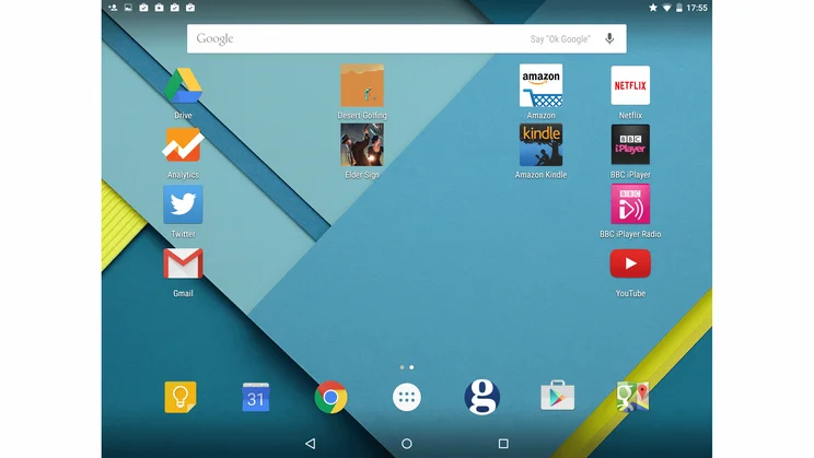
Android Lollipop (version 5.0) is the biggest update to the operating system since the move to Android 4.0 back in 2011, which unified the divergent smartphone and tablet versions of the mobile operating system. This new version of Android is designed not only with those devices in mind, but also smart watches, smart TVs and even smarter cars. That’s getting a bit ahead of ourselves though, as though Android-powered everything may be the future, for now it’s only just rolling out on the most popular smartphones and tablets.
It’s worth noting that smartphone manufacturers make large modifications to their handsets – tweaking the user interface to fit with their hardware design, adding new features to the operating system, and even omitting features that Google has included in the ‘standard’ version of the OS. For this reason you may find your updated phone doesn’t look like our screenshots, but most of the functionality should still be there.
A good example of this is with the Android 5.0 update for the Samsung Galaxy S5. As Samsung uses its own TouchWiz UI for Android, the Lollipop update isn’t very different to look at when compared to the original Android 4.4 version. On top of that Samsung decided to not to implement multiple user accounts, although you do get the new task switcher and most of the new features that we talk about here, plus the improved core of the OS. As such, we can’t explain how Android Lollipop will look on every handset that gets the update.
If you’re updating your device we strongly advise that you reset it entirely first by backing up your data and then using the Backup and Reset option under Settings. A fresh start should liven up your device’s preformance, clear away years of old apps you never use and prevent most upgrade problems.
When will my phone get Android Lollipop? Our Android 5.0 update guide
This updated review is based around the current bugfix version of the operating system, Android 5.0.1, which should fix some issues around Wi-Fi connections and battery life. Now, we weren’t overly bothered by these problems to begin with but it’s good to see Google are on top of things.
FIRST LICK
If you’re starting from scratch then the first new feature doesn’t take long to surface. Android 5.0 asks if you want to restore the state of another Android device on this one. This means it can install all your apps, add your various shortcuts and widgets, and place them all on the homescreen just where you like them.
It provides you with a (most probably mammoth) checklist of apps. We cut down the 101 apps installed on our Nexus 5 to a much neater list of 13 to be installed on our test Nexus 9. Greyed out icons are then placed on the homescreen in positions relative to those on our phone, with the icons filling with colour as they installed. If you reset a device you can also restore its last state back to it, so you can factory reset your device and restore everything in a few simple clicks.
Other than that, setup is as easy as ever, just pop in your Gmail address and password and you’re ready to go. Android even remembers Wi-Fi passwords from device to device, so any network details on your previous phone or tablet will be passed over to the new device.
If you’re concerned about security, and you should be, then Android 5.0 will let you lock and unlock your device using another device. Support for Bluetooth and NFC devices means your Android device will unlock instantly in the presence of, or at a tap from, your chosen item. You can of course use a PIN or screen lock pattern should you lose, or forget to bring, your chosen unlock device.
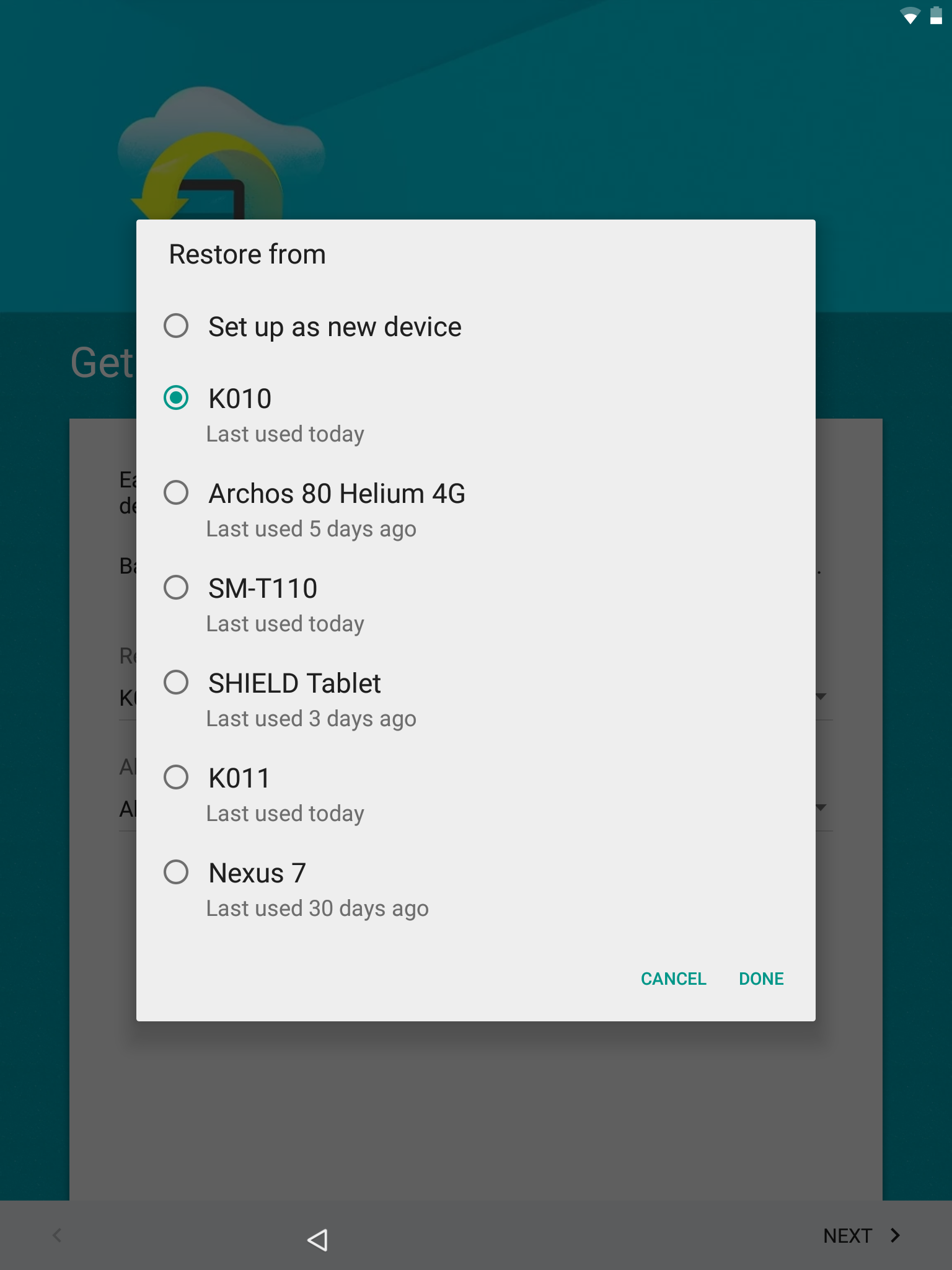
^ Android can restore apps and data from another device to your new one, or even restore the state of a lost device
MATERIAL GIRL
Trends in graphic design don’t come along everyday, so it’s not surprising to see that Google has followed Apple in making an operating system that is simply put: flatter. Icons are simplified with more blocks of plain colour, rather than looking like little 3D rendered objects. Colour is also in vogue, with more colourful icons, more varied colours and more unusual combinations.
The operating system itself is still doing 3D rendering of course, but each object, which Google refers to as a piece of ‘Material’, is flat, like a series of pieces of paper. They can move up and down off the homescreen, cast shadows and be dragged over other objects, but they don’t have any depth themselves. If you interested in the design aspects then head over to Google’s own site on Material Design.
Google has been updating the icons on its big services into its new style for some time, so Chrome, YouTube, Google+ and others are unchanged from their current incarnations, but they now match the new icons for things such as Calculator, Calendar, Clock and Downloads, see below.
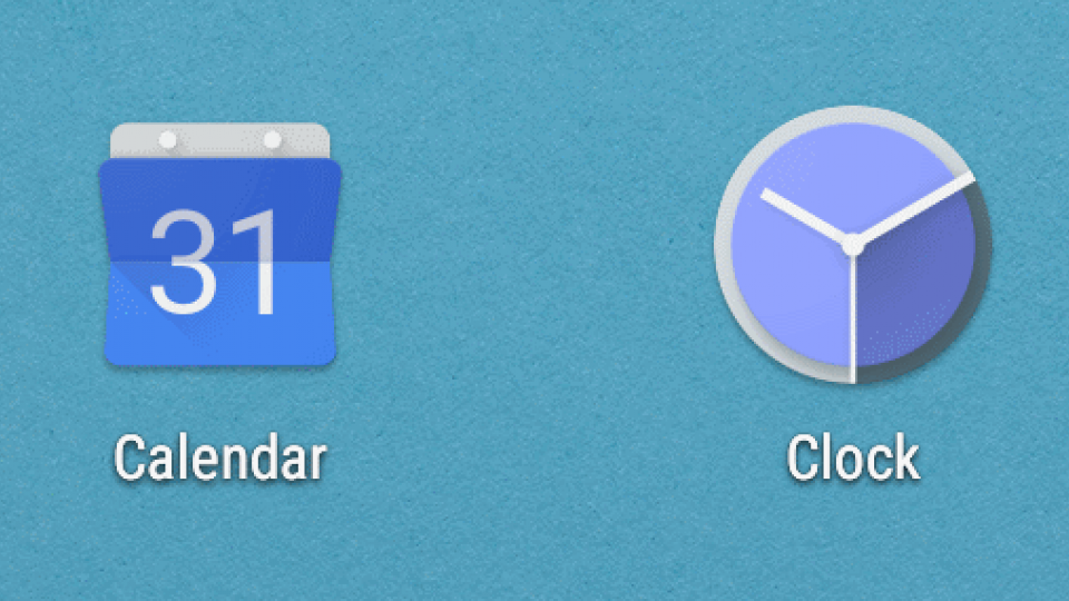
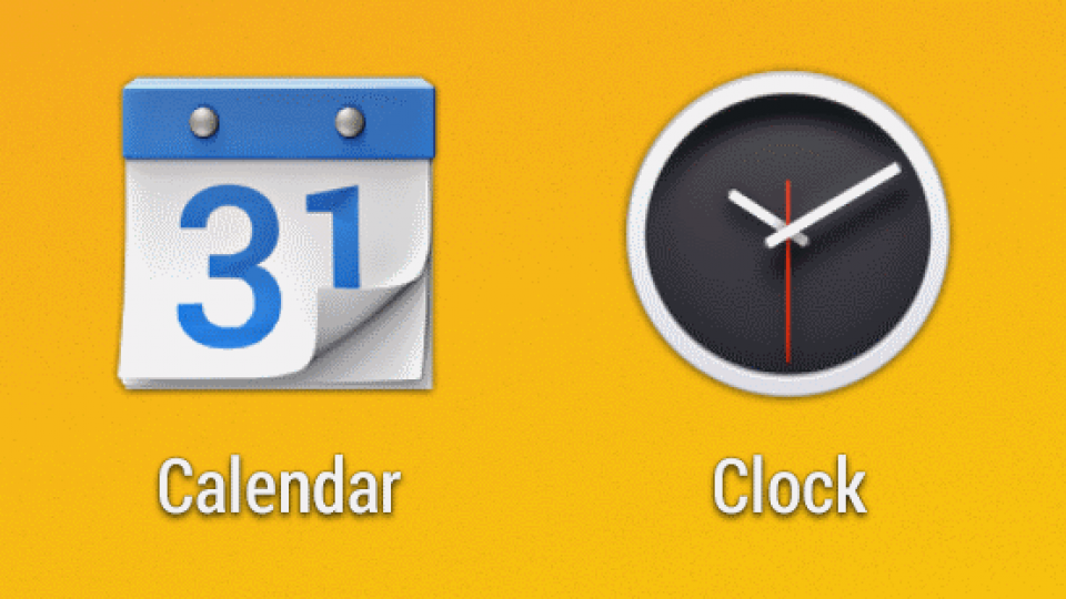
^ You can clearly see the difference in design ethos between these Android 4.4 and Android 5.0 icons. You may also have noticed a new ‘Material Design’ styled logo for Google Maps on your own smartphone
All that extra colour has a new white background to shine against too. White was once a pretty bad idea for a mobile operating system, as all that brightness eats battery life, but such things aren’t as critical as they once were, and white looks a lot more approachable than black. The main example is that the app tray now has all your apps sitting in a white window, rather than just hovering over a soft-focus version of your current wallpaper.
Now all this white didn’t just appear from nowhere, it has been in the pipeline for quite some time in the form of Google Now. More and more of Google’s operating system is coming to act and look like the little cards of useful information that make up the service. Notifications are now on a white background, and the recent apps buttons brings up a rolodex of cards, one for every app.
Recent Apps (also called Overview) does provide a far clearer idea of what’s going on in each app, but it’s undeniably a little slower to navigate than the old pop-up list. One major change is that by default Chrome tabs each appear as a seperate app in the task switcher, rather than only within the Chrome app itself. You can change this back to the way it worked previously, but we quite like having our tabs and apps mixed in, as you can easily work back through what you’ve been doing in one place – seeing the appropriate Chrome tab right next to the game you were looking up an FAQ for, as an example.
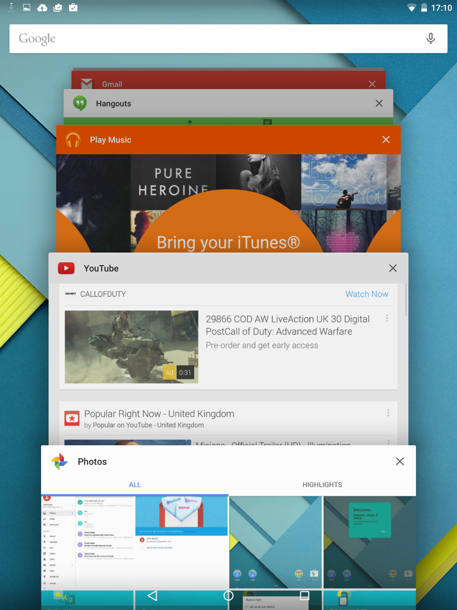
^ The new app switcher, Overview, is easy to use and looks great
Other changes include a new font, which is finer but keeps the same pleasing simplicity. Brightly coloured floating buttons make it really easy to see how you create a new contact, appointment or email. Plus the three buttons at the bottom of the screen have been simplified into a triangle, a circle and a square, replacing the curved arrow, house icon and multiple window icon that previously represented Back, Home and Recent Apps.
Simpler, brighter, flatter and more colourful, the new Android looks very smart indeed.
THERE’S NO PLACE LIKE HOME
The Android homescreen really hasn’t changed all that much in terms of practicality, but then it was always flexible compared to its main rival. You can still put app shortcuts just where you want them, drag them into folders and mix-and-match these with widgets from a huge number of apps, many of which are resizable to suit your needs.
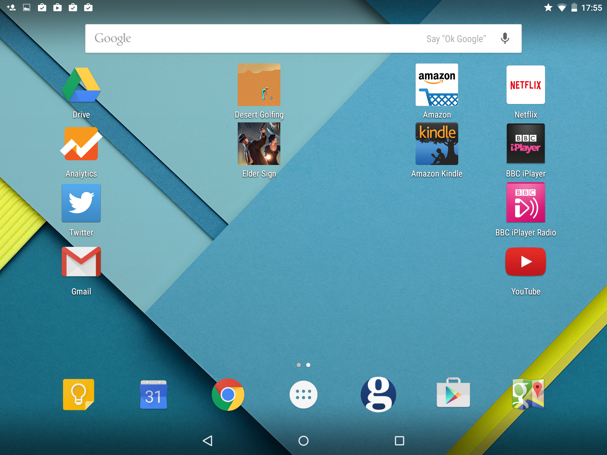
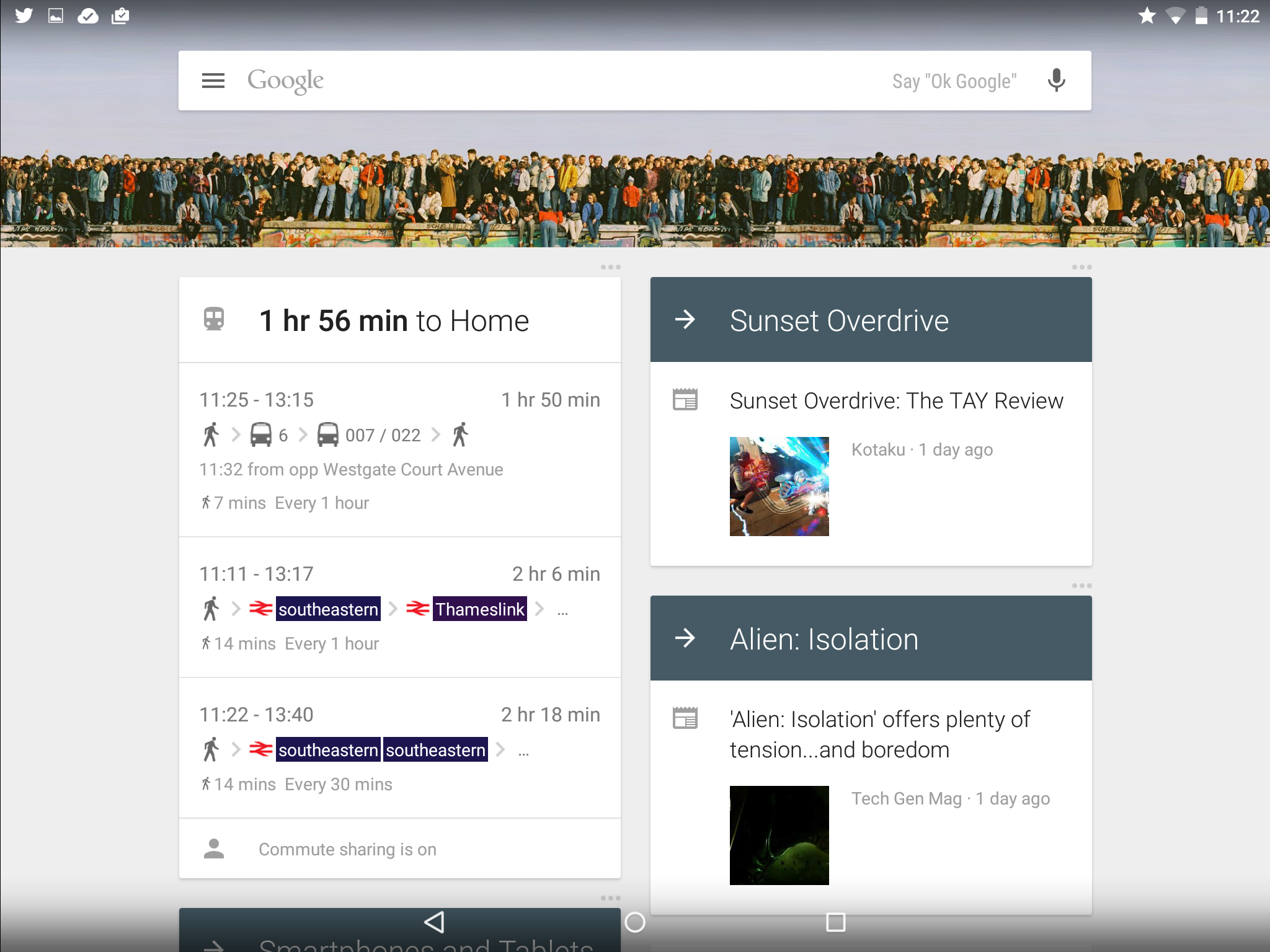
Our Nexus 9 had a 6×5 grid on each homescreen to position all this on, with 6 extra spots below in a dock for regularly used apps. While our Nexus 5 sticks with its usual 4×4 grid with a 4-spot dock beneath. New homescreens are created to the right when required and Google Now sits to the left – seen below in its tablet-friendly two-column layout.
MENU BAR AND NOTIFICATIONS
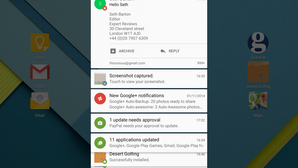
The menu bar displays the usual split of notification icons on the left and handy indicators, such as network status and battery life on the right. Swipe down though and you get an all-new combined settings and notifications menu, which consists of white cards over a darkened homescreen.
Each card can be tapped to open it in the appropriate app, dragged down to see more details if they exist. Some also have instant actions you can take, such as replying to emails, or snoozing an event reminder. This works much as before, except for its appearance and some slick animation.
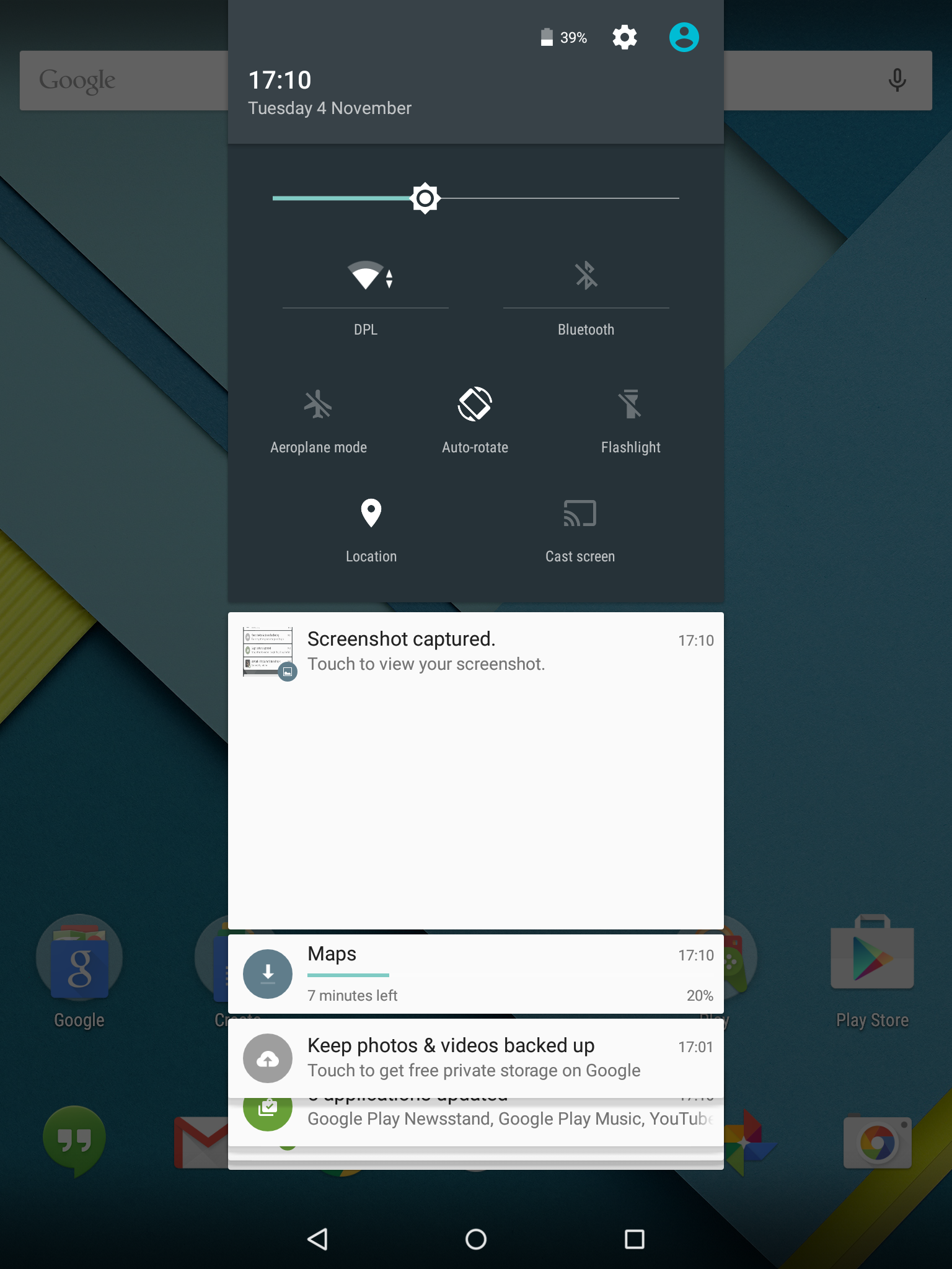
Swipe down again, or just once with two fingers, and you get a handy settings shortcut panel. There’s a brightness slider, though strangely the auto brightness toggle is tucked away in the settings menu. We’d much rather have an auto-brightness button by the slider, which can then be used to tweak the level selected by the sensor.
The settings shortcut panel also shows Wi-Fi strength plus the name of the current connection which you can tap to switch connections quickly; plus there’s Bluetooth too. There’s buttons for Aeroplane mode, auto-rotate, a built-in flashlight (so no more flashlight apps), a turn on/off location sharing button, and a cast screen button to connect to a Chromecast easily. You can see a battery percentage charge, plus it will estimate charging time to full as well.
Tapping the volume control brings up a menu that lets you control who you get notifications from. You can quickly set this to ‘All’ for no filtering; or limit incoming calls, and email alerts, to only a small set of ‘Priority’ contacts, basically those starred in your contacts list; or turn off such notifications altogether. You can also set downtime, so you could set up a rule so that only priority notifications come through in the evenings. It’s a bit confusing to use at first, and requires careful management of your contacts list to work well, but it’s still a welcome extra.
^ The new notifications bar contains Google-Now styled cards
Tapping the volume control brings up a menu that lets you control who you get notifications from. You can quickly set this to ‘All’ for no filtering; or limit incoming calls, and email alerts, to only a small set of ‘Priority’ contacts, basically those starred in your contacts list; or turn off such notifications altogether. You can also set downtime, so you could set up a rule so that only priority notifications come through in the evenings. It’s a bit confusing to use at first, and requires careful mamngement of your contacts list to work well, but it’s still a welcome extra.
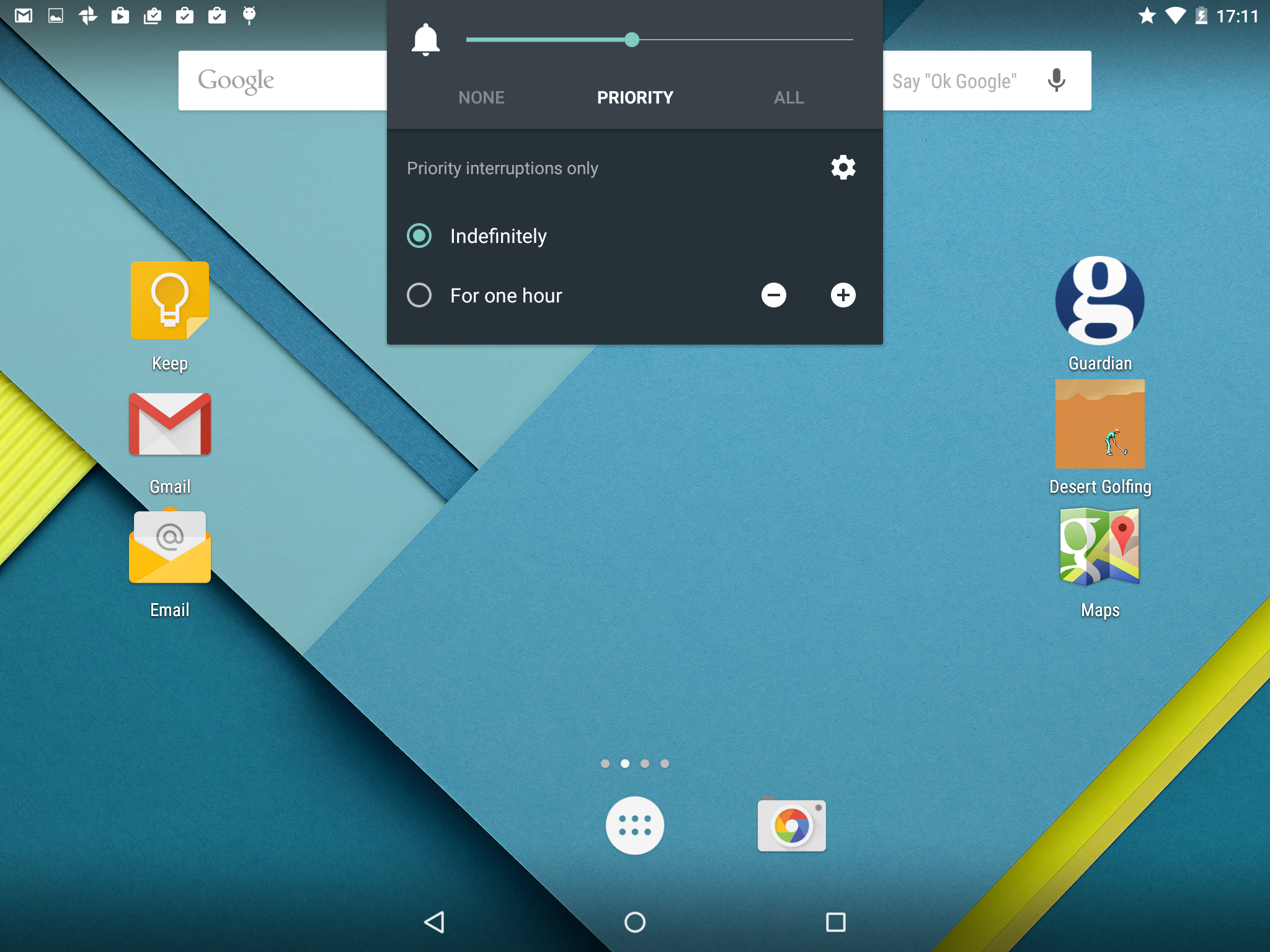
^ You can decide who can disturb you using the new notifications controls
IMPROVED APPS
We’re not going to go through every app built-in to Android 5.0, but we will break down the changes made to a couple of key ones, Gmail and Calendar.
Email is now entirely subsumed into Gmail, which has a new tablet-friendly interface, consisting of three columns. The first, which is always visible but expands out when in use, lets you select from folders, labels and email accounts. As well as support for multiple gmail accounts, you can add IMAP, POP and Exchange accounts – with the old Email app simply redirecting to this one. It makes sense for Google to concentrate its efforts on a single email app, and it makes it quicker and easier to deal with multiple accounts in one place.
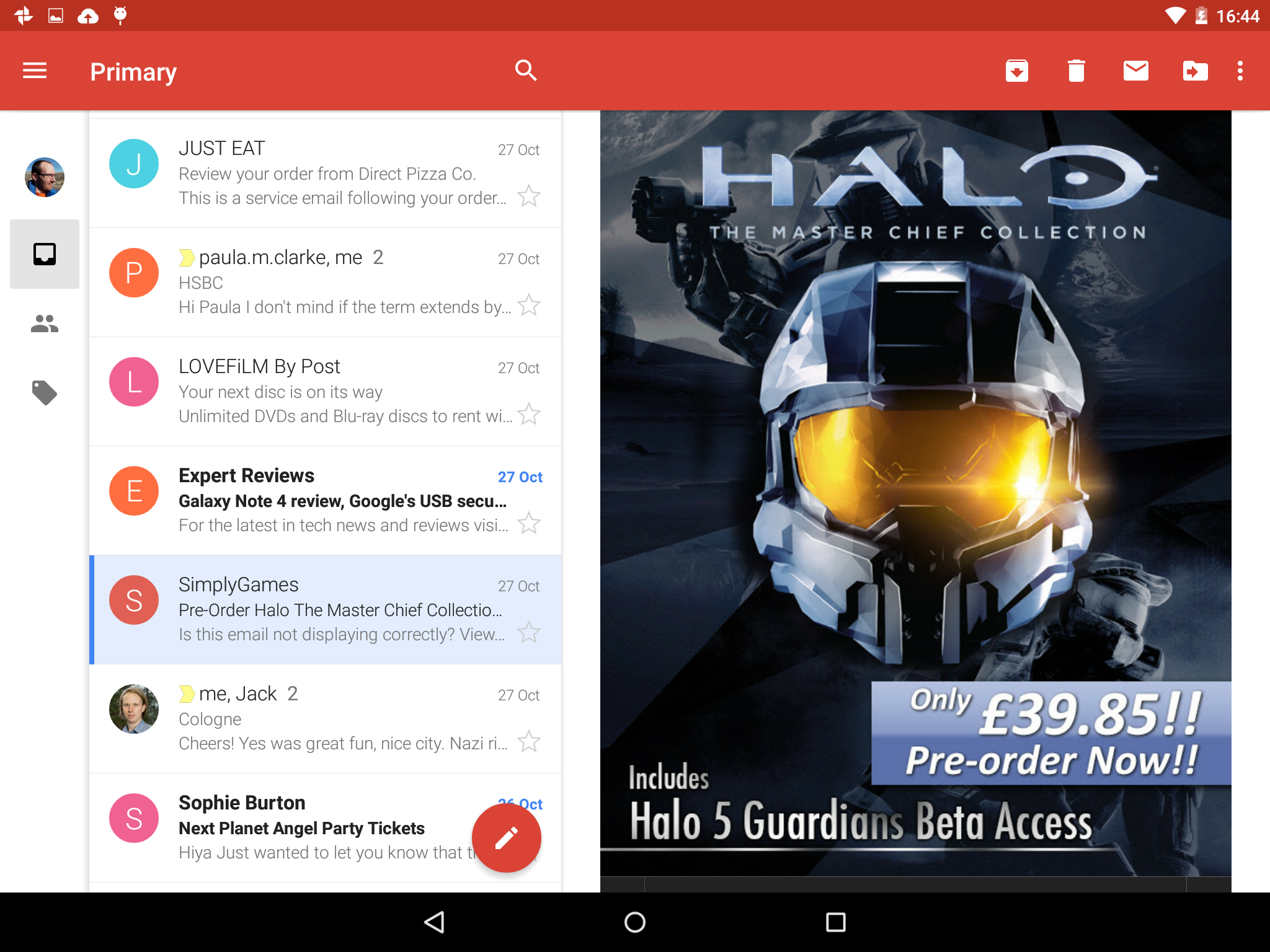
The second column is then a list of your emails in that account or label, with the usual subject and other info. At the bottom of the list is a floating round icon for composing a new email. This looks a little odd at first, but is far easier to find than the previous compose buttons hidden on menu bars.
The third column lets you read the currently selected email, though sending replies opens a full screen window for you to write in. You can also switch to the next email by simply flicking left or right. This column only appears in landscape mode, with the app reverting to a two column mode in portrait mode.
The whole app is remarkably slick and responsive on the Nexus 9, with emails opening instantly, menus scrolling without the slightest hitch, even back through a week of email, which is the amount it caches (no options to cache more disappointingly). It’s sliding columns aren’t radical, but with a range of improvements, and support for most your email needs, this is arguably the best mobile email app around.
Google has also rebuilt its woeful calendar app into something rather useful. The new app looks a bit like a calendar you’d have hanging on your wall (in month mode anyway) and even has background art depicting the season for that month (we wonder if it switches round in the southern hemisphere?).
In month mode, which is best for casual users who only have a couple of appointments a day, the new calendar actually shows you the names of your appointments rather than simply coloured bars. It’s still not quite up to the simplistic zoomy brilliance of Touch Calendar, but the search giant is finally catching up with an app developed by a single man in his spare time.
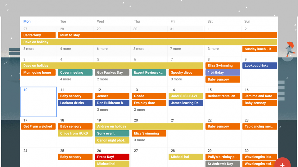
^ Google’s Calendar app is finally starting to work for us
UNDER THE HOOD
On the surface Android hasn’t changed radically then, but under the hood it’s a very different beast indeed. The headline has to be support for the new 64-bit mobile chipsets, such as the Nvidia K1 chipset used in the Nexus 9, or the upcoming 64-bit Snapdragon chipsets, most notably 808 and 810.
A switch to 64-bit should bring sizeable performance gains when dealing with complex tasks, where the processor’s larger registers can handle bigger numbers. It will also raise the memory limit above the current 4GB ceiling, though that’s not really an issue today for mobile devices.
The operating system itself now runs and compiles code differently too, with the new Android Runtime (ART). We should see performance and battery life benefits from the new system, which compiles code to be executed on installation, not when the application launches. It also supports x86, ARM and MIPS processor architectures in both 32-bit and 64-bit. So apps running on some platforms but not others, most notably Intel Atom chips, should soon be a thing of the past.
Google has also looked to improve battery life through numerous improvements under the name Project Volta. This aims to reduce unnecessary battery use when the handset is performing basic tasks such as waking from standby and checking for emails and other updates. The operating system is more efficient in how it deals with such housekeeping tasks and developers have been provided with better tools to manage their battery usage.
Tests on the developer version of Android 5.0 have shown around 35% improvement, and we were impressed by the 16 hours of video playback we got from our review sample of the Nexus 9.
In addition there’s a battery saver mode that you can start manually or get to kick in at a certain battery level, say 5%. This throttles performance, the Sunspider score more than doubled to a sluggish 2,156ms, and it restrains radio usage, so apps don’t update unless you open them. It looks handy, stretching out your last hour of battery life without the usual dance of disabling Wi-Fi and mobile internet (which renders your phone pretty useless anyway). You know when it’s running as the menu bars turn orange to warn you.
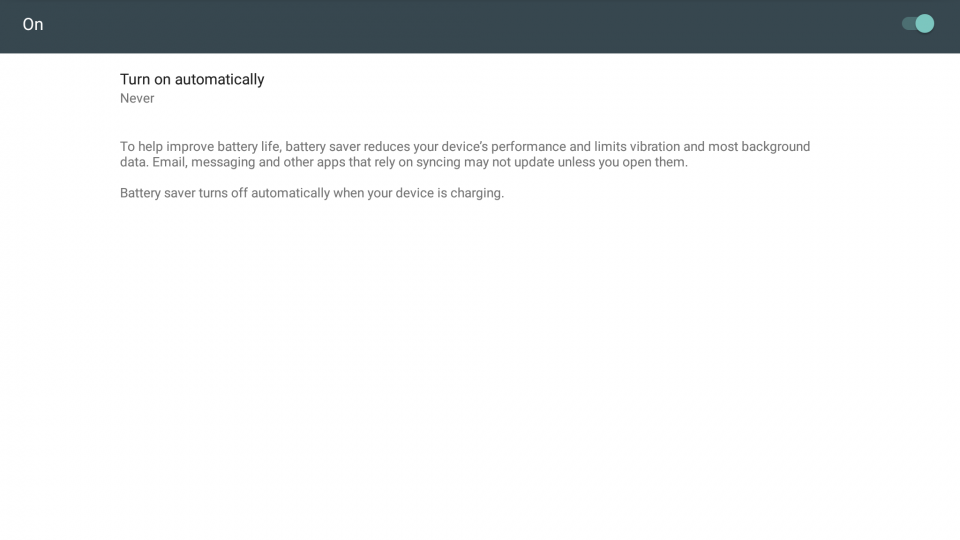
^ You won’t miss the orange bars warning you that Battery Saver is active
CONCLUSION
Android 5.0 Lollipop looks great, the new design and colours really are a breath of fresh air. All the built-in apps we use regularly have had major facelifts and most have been improved in the way they work too, easier to understand and with better tablet-landscape layouts.
Beneath the hood the operating system is certainly much improved too. Battery life looks to be excellent, though we’ll need to do before-and-after testing on a wide range of devices before we can confirm that. Support for 64-bit is a must of course, but it’s still welcome.
It’s early days, and so there are some issues with some apps, but for most Android device owners we’re happy to say that an update to Android 5.0 is something to look forward to, with most of the niggling bugs we found with the initial release have already been fixed.
Android 5.0 is simply the best version of Android yet. The changes are evolutionary and mostly under the bonnet and in its new, more streamlined design. Google has increasingly moved new features into the apps that support the main operating system, and that gives it and handset manufacturers lots of room to manoeuvre when it comes to adding extras. With 5.0 Android takes another step forward and we look forward to using this flexible new operating system on more kinds of devices.


