To help us provide you with free impartial advice, we may earn a commission if you buy through links on our site. Learn more


With Android 3.0 Google is striking back against Apple, creating an OS that’s entirely designed to be run on the high-resolution, large screens devices, rather than expanding the smartphone edition to simply fill the screen.
To this end, the OS has been given an entire overhaul, although there’s enough similarity to the smartphone versions that it’s easy enough to pick up and use. We previewed the OS using the Android Developer Kit, but we’ve got our first Android 3.0 tablet in, so have decided to give the OS its own review.
One of the biggest changes with Android 3.0 is that there are no hardware navigation buttons any more.

Instead, back, home and menu are all soft buttons located in a bar at the bottom of the screen. Depending on the application, this bar is either always visible or it slides out of the way when it’s not being used – tapping the bottom of the screen restores it. Given the larger screen size of a tablet, not having any buttons makes lots of sense and makes Android 3.0 easy to navigate.
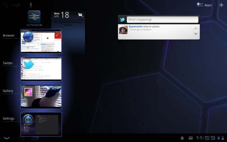
We love the new task switcher button, which brings up a thumbmail list of recent applications. Just tap the one you want to switch to it. It’s much more elegant than the iPad 2’s system.
Widgets
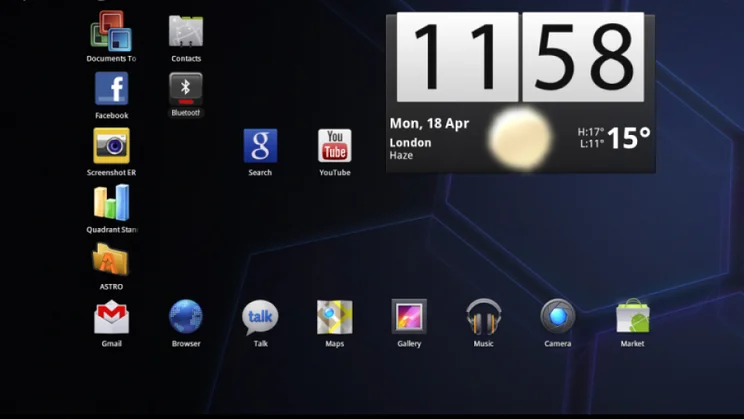
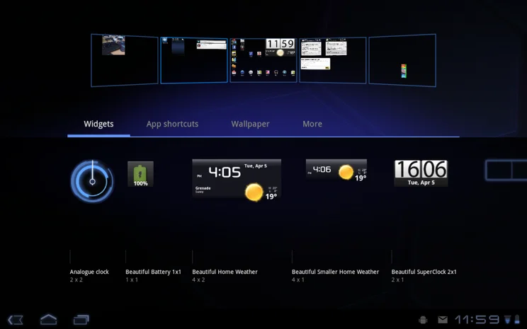
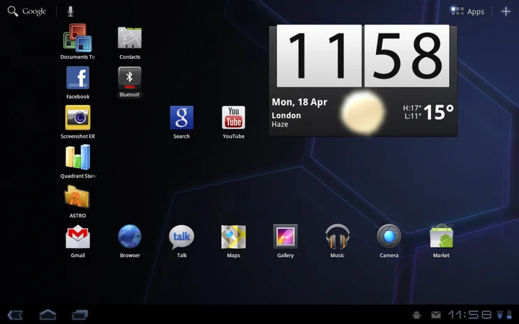
One of the best things about Android is its customisable home screens. This remain in Android 3.0, with five screens available. Widgets and shortcuts can be added by pressing the Plus button. This brings up a list of shortcuts and widgets, plus it shows a thumbnail view of every home screen. All you have to do is drag and drop the app you want on to the right screen, plus you can tap a home screen to jump to it quickly.
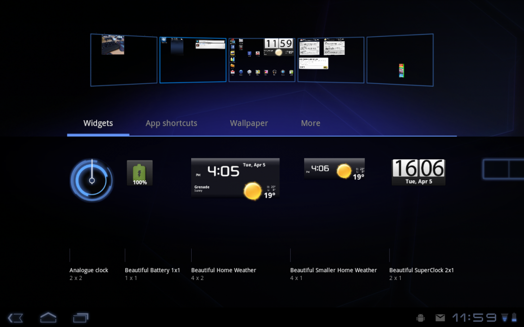
A grid system is used to place widgets and icons, but it’s a smart system that keeps the relative position of objects when moving from landscape to portrait. For example, place a widget in the top right of the screen and it will be there in both landscape and portrait orientations.
Switching between home screens is just as easy as on a smartphone, only the 3D animation is a little bit slicker to watch.
Power and settings
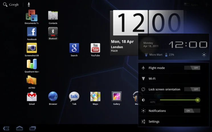
Settings are housed in the notification block at the bottom of the screen when you tap the clock. From here you can access the main settings page, jump straight to Wi-Fi settings, put the tablet in flight mode, adjust screen brightness and lock the orientation of the screen.
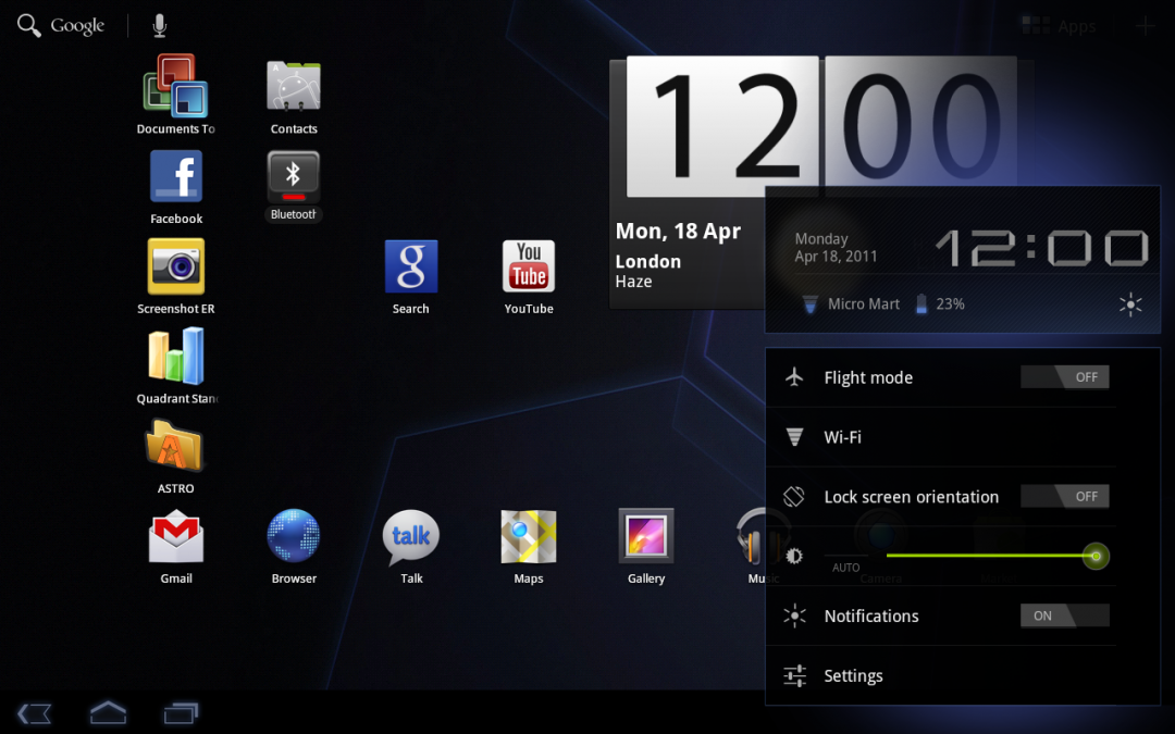
This works well enough and it’s good to have shortcuts to some of these features, but there’s no easy way to turn off certain devices to save power, such as Bluetooth and GPS. In fact, there’s no longer a widget for power control, which seems like an odd omission to us. You can still buy these from the Market, such as with Beautiful Widgets, but we don’t understand why it’s not there in the first place.
The new settings menu is an improvement. While it’s the same layout as the smartphone edition, the menu is always visible in one panel. Select an entry and its options open in another panel. It’s a slight tweak, but makes it easier to change options.
Notifications
While the smartphone edition had a notification bar at the top, which you had to pull down, Android 3.0 uses the bottom bar. This shows you when you’ve got new texts and emails. You don’t need to pull the bar up, though, just tap the icon you’re interested in for more information, then tap that pop-up to view the data in the app that triggered the notification, such as Gmail.
Again, it’s not a big departure from the smartphone editions of Android, but makes more sense on a larger screen with a higher resolution.
Web browsing
We love the look of new web browser, which mimics the look and feel of the desktop edition of Chrome, with similar tabs for multi-tab browsing, as well as the buttons for bookmarks, back and forwards. It can even be set up to be synced with the Desktop Chrome, although currently only bookmarks are supported, rather than passwords and form data.
It’s also frustrating that there’s no home button directly on the browser screen. Instead, you have to select Bookmarks and hit the Home button from there. We don’t understand why this can’t be moved to a more convenient place.
Browsing is slick and smooth, from what we’ve seen and the new browser seems to do a better job of rendering pages than the smartphone edition. This is particularly true when Flash is involved. Using the smartphone edition, we found that Flash objects would often obscure other parts of the page, such a website menus; with Android 3.0 this problem has gone and Flash objects behave properly.
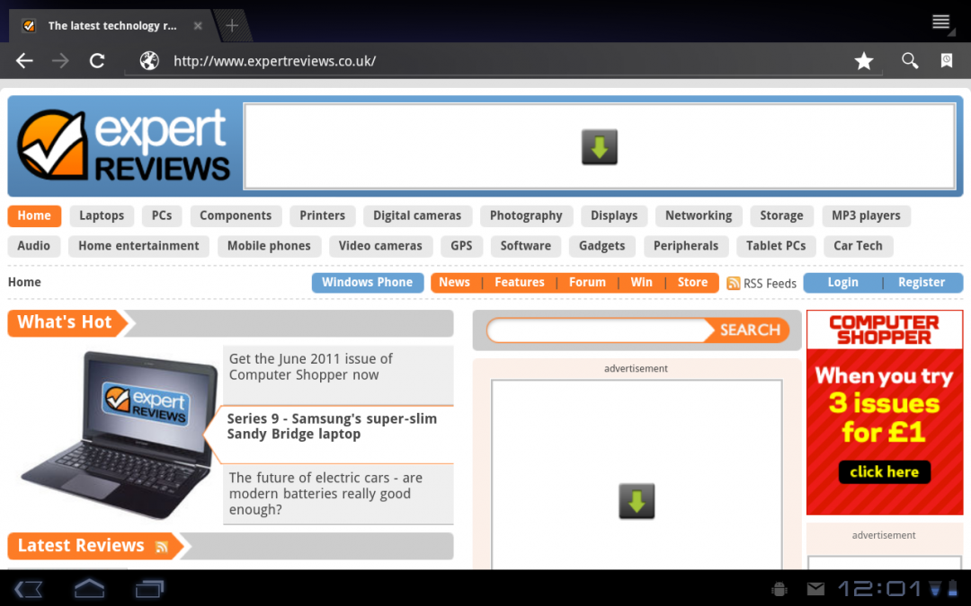
That’s not to say that they don’t slow down browsing at times. For that reason, we recommend setting Plug-ins to load on demand, so that you can choose when you want to view Flash content and when you want faster browsing.
Most web pages load correctly, but the browser does make some rendering errors, such as overlapping some text. These errors are few and far between, and tend to occur on very busy websites, such as Expedia.
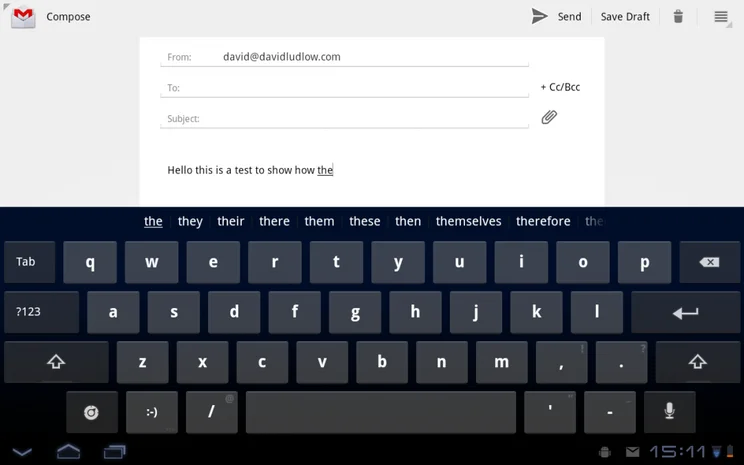
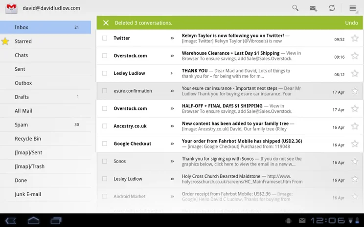
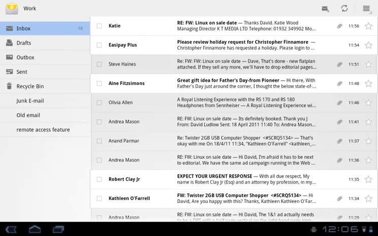
Email and Gmail
Both the Email and Gmail apps have had an overhaul, too. In landscape mode they present a list of emails on the left, and the contents of an email in the preview window. It makes it quicker to browse through email and makes full use of higher-resolution screens. We like the fact that the buttons to move between emails are called Newer and Older, as it makes it clearer what they do.
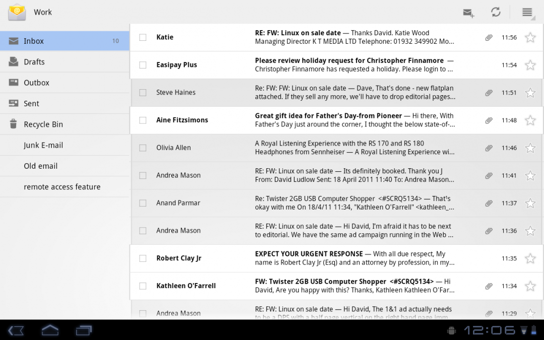
In Portrait mode, the list of emails disappears, but tapping the side of the screen brings it back. It’s useful to be able to do this, but we feel that the applications work better in landscape mode.

Rather than relying on sub-menus, there are dedicated always-visible buttons to manage your email, including delete, new mail, move and reply.
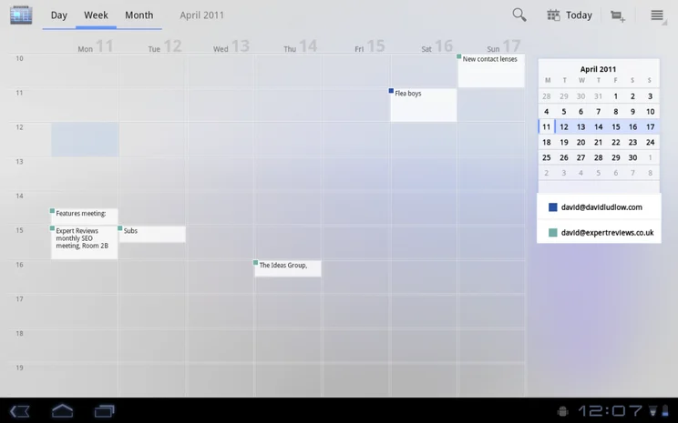
Calendar
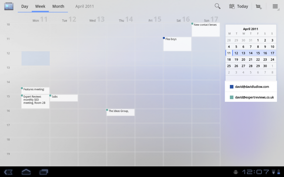
The new calendar makes good use of the larger screen resolution. In all, but Month view, you get a thumbnail calendar, allowing you to quickly skip to a particular date or week. Google has also implemented multi-touch into it: zooming in or out shows more or less time on-screen, allowing you to quickly get an overview of a week or day, then zoom into view the detail.
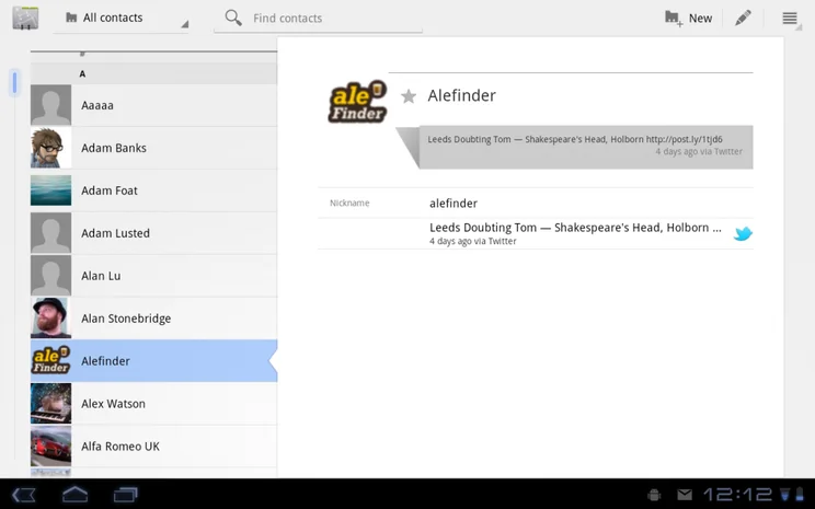
Contacts
Contacts remains similar to standard Android, bar the fact that there’s now a panel containing the list of contacts and a pane to display the actual information. The app can pull in detail from other apps, such as the latest Tweet from a contact.

Again, Contacts is another example of a app that has been tweaked to make the most of higher screen resolutions, making it easier to use on a tablet.
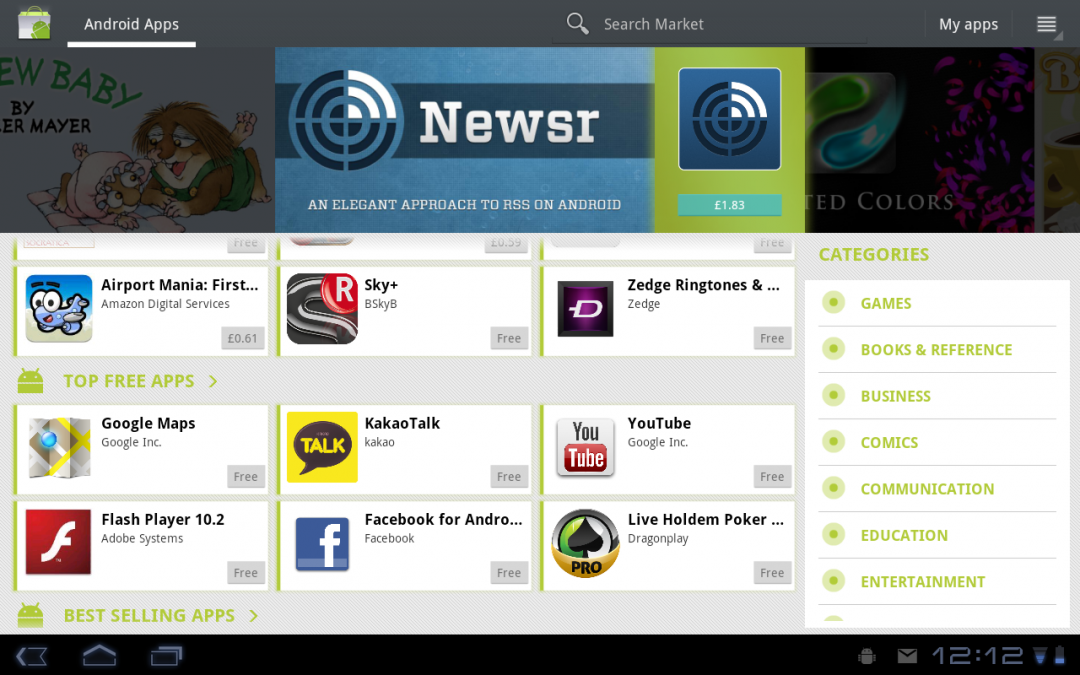
Market
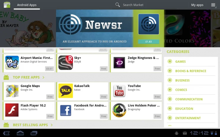
The Market has been given an overhaul, so that it now has more in common with the web version than the smartphone edition. It uses the full screen, with a set of promoted apps on the home screen, plus a panel of categories to navigate.
Viewing an app, keeps the Download or Purchase buttons in a fixed panel, while the description and users reviews are in a scrollable side panel. It makes it a bit quicker to find an app, read through the information to make sure it’s what you’re after and install it.
We still found that the Market can be a bit annoying to use at times, and we had to manually sign into Talk to make some downloads start.
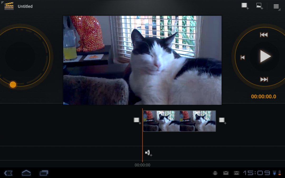
Video editing
Film Studio is the new app for editing video on your device. It’s incredibly simplistic and allows you to join multiple clips (or photos) together, trim clips and add music. Once you’re done you have to save the results and go back to the Gallery app before you can share the results with YouTube or friends. Better sharing built in would have been nice, but it’s not a big problem.
Old apps
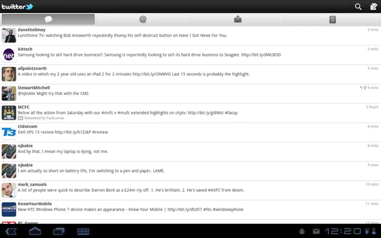
Old smartphone applications will work on Android 3.0, but not always perfectly. Some look pretty stupid in fact, taking up the entire screen. For example, the official Twitter app looks sparse when blown up to full screen.
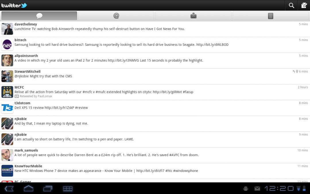
To be fair that’s not the operating system’s fault, but more that there aren’t currently a lot of Android 3.0-specific applications, although that’s bound to change as the OS becomes more popular.
Keyboard
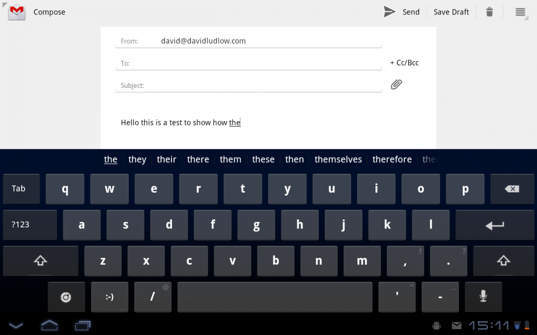
The large keyboard is very easy to use and type on. Some punctuation can be got at by long-pressing a key, while the auto-correct remains the same as in Android 2.3. We’re pleased to report that cut-and-paste also makes it over from Android 2.3, complete with the bounding arrows to make selecting text easier and faster. In this way, Android keeps up with iOS.
Conclusion
Android 3.0 is a much better tablet experience than simply sticking the smartphone edition on a larger screen. It does a good job of retaining similarities between the two, so that Android 3.0 is instantly useable for Android users. Where Google has improved apps with extra panels, it’s a massive improvement.
However, we found it annoying that some things seem to have gone missing, such as the Power Control Widget. Older apps can end up looking pretty stupid on high resolution screens, too. On the hardware we’ve tested, the transitions and animations aren’t quite as smooth as they are with iOS.
The browser’s a big improvement, but it struggles with some web pages and makes the occasional formatting error. Even so, it’s a big leap forwards and the range of tablets that will be available will mean that there’s serious competition to the iPad 2 for once.
| Details | |
|---|---|
| Price | £0 |
| Details | www.google.com |
| Rating | **** |