Technology

Five good reasons you should buy a laptop with an Intel® Core™ Ultra Series 3 processor inside
The latest Intel® Core™ Ultra Series 3 laptop chipsets from Intel have redefined what buyers can expect from a modern laptop in terms of battery life, power, AI enhancements and graphics performance
-
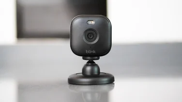 Six reasons why this is the best security system to keep your home protected With a bewildering array of home security products on the market, the Blink Whole Home Security Kit Plus is an affordable, high-quality, easy-to-install and easy-to-use system that provides security at your front door, indoors and outdoors
 -
 Soundcore's latest earbuds have AI note-taking built in Anker's next-gen true wireless headphones come with boosted AI tools and a touchscreen case
 -
 Roku releases two new budget projectors in time for World Cup Two new models come with autofocus and autokeystoning and will (probably) cost under £200
 -
 The best laptops to buy right now Looking for a new laptop? We’ve reviewed and tested loads of them but only the best make our list
 -
 Arlo Essential 3 2K Pan-Tilt: A top-quality but pricey Pricey cloud storage makes this camera hard to recommend£90
 -
 Microsofts latest Surface laptops are out and they're pricey Could latest models could signal an end to Snapdragon Surface machines?
 -
recommended
 Sony 1000X The Collexion review: Sony’s best-sounding headphones, but you probably shouldn’t buy them The Sony 1000X The Collexion are Sony’s most impressive over-ear headphones yet, but not the best choice for most people£550
 -
 BT Broadband review: The best broadband for families, but there’s little else to recommend Worth considering if you need family-friendly internet filters on your broadband
 -
recommended
 Plusnet Broadband review: A solid, unspectacular performer at a reasonable price If you’re looking for no-nonsense, reliable broadband, Plusnet has much to offer
 -
best buy
 Vodafone Broadband review: A winning formula of speed and great value deals Our top provider thanks to a combination of superfast performance and terrific value
 -
 The best broadband providers in the UK for 2026 We surveyed 1,500 UK residents to help you pick the perfect broadband provider for your home
 -
 The best mobile networks in 2026 We’ve picked out the UK’s best mobile networks, based on our annual awards survey, Ofcom research and RootMetrics’ latest performance tests
 -
recommended
 Asus Zenbook A14 (2026): The ultimate compact laptop * but there's a caveat: it's far too expensive£1599