
To help us provide you with free impartial advice, we may earn a commission if you buy through links on our site. Learn more
- Slimmer than last generation
- Signature Editions are more appealing this time
- Far better novel reading experience than a phone
- No major improvement to display colour or contrast
- A little heavy with page turn case attached
- Pricey
The Amazon Kindle Colorsoft colour screen e-reader has been refreshed for 2026. Let’s cut to the chase: do owners of the 2024 version need to upgrade?
No. There’s your answer.
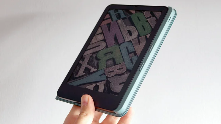
The Amazon Kindle Colorsoft has a slimmer case, optional aluminium back (instead of plastic) and now supports a case with integrated page-turn buttons. The core tech remains the same as last time, however, so all the key strengths and weaknesses remain, too.
The same E Ink panel tech means colour depth is limited, and contrast is worse than that of the base Kindle or Paperwhite. For a more substantive upgrade, we’ll have to hope Amazon one day gets on board with the just-announced Kaleido 4 tech set to land in 2027.
The Amazon Kindle Colorsoft remains a lovely thing to own, but we’re still in what feel like the relatively early years of mainstream colour e-readers. It could be the right fit for you, but don’t assume it’s better than the standard Paperwhite for your needs.
It’s also a little pricier than direct rivals the Kobo Libra Color and Pocketbook Era Color, although not by a dramatic amount.
What do you get for the money?
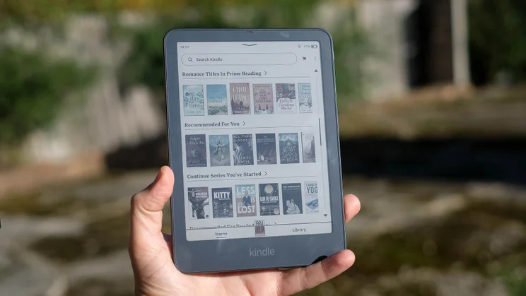
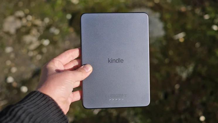
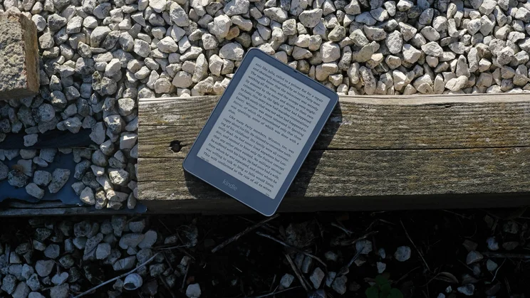
Like the first Kindle Colorsoft, the new version is basically a Kindle Paperwhite but with a colour E Ink display. It has a 7in screen and, new for this generation, you can choose whether to have an aluminium rear or a soft-touch plastic one.
Amazon’s base Colorsoft costs £260, while the metal Signature Edition is £30 more at £290. The upgrade nets you double the storage (32GB), the aluminium rear and an auto-adjust front light.
I’ve never run short of storage on a Kindle — novels don’t take up much space — although the additional room will be more meaningful for the graphic novel fans out there. Similarly, I still find I need to manually adjust the light level most of the time, so don’t expect too much from the auto-adjust screen. But the choice of metal or plastic is neat, and the £30 difference is minor compared to, say, Apple or Microsoft tech upgrade costs.
One reason to stick with the cheaper model is weight. A plastic Colorsoft weighs 204g, the metal one I have weighs 229g. Add the case with buttons and, according to my kitchen scale, you’re looking at a total of 349g for the metal variant. This is a little hefty for relaxed one-handed in-bed reading.
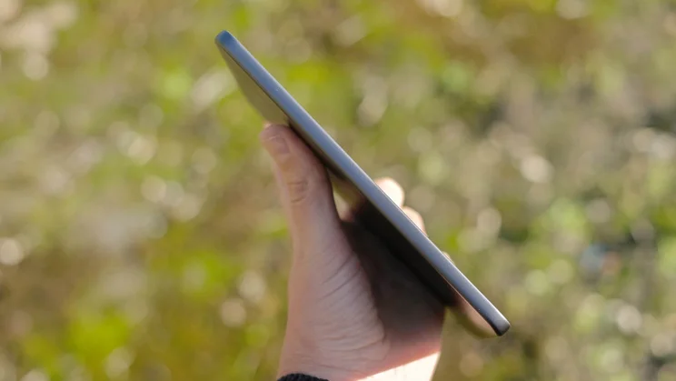
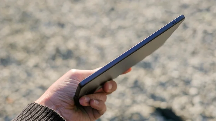
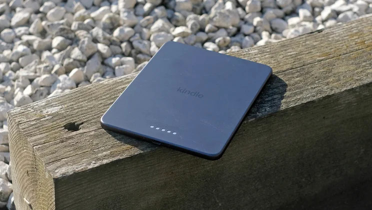
The new design also shaves a millimetre off the thickness of the e-reader itself, at 6.8mm thick down from 7.8mm in the last generation. The metal has a more expensive tablet-like feel, but you do lose something in the transition away from the arguably more ergonomically pleasing curved case of the previous model.
Pick the metal version and you can choose between a moody purple or Graphite (slightly lighter than the old black casing) in order to better match the off-black of the E Ink panel. Stick to the base Colorsoft and the casing only comes in Graphite.
Buttons, but not for buttons
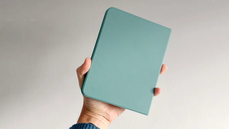
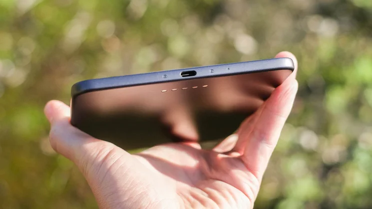
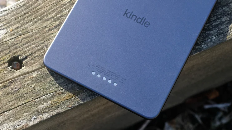
The Page Turn case is something genuinely new for the series, though. It interfaces with a line of metal contacts on the Kindle Colorsoft’s rear, adding a pair of page turn buttons that connect without any need for wireless tech. It’s expensive, though, at £75. Considering that cost, I wasn’t all that impressed by the button feel, either.
There is some positive clicky feedback, and some travel, but Amazon doesn’t demonstrate quite the haptic attention to detail you get in, for example, Microsoft’s Surface series accessories. Still, if you’ve been mourning the Kindle series’ loss of physical buttons since the Oasis was discontinued in 2024, you’re sorted. There’s another option too, the £32 Kindle Click remote wireless page-turner accessory.
Normal, button-free cases start at around £40 for first-party designs, although third-party ones often cost far less.
How I tested the Kindle Colorsoft (2026)
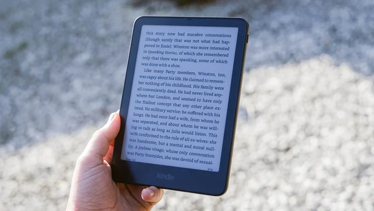
I mostly use Kindles to read novels. A Colorsoft calls for a bit more diversity, so I also dug into the selection of Batman graphic novels sitting in the deep recessed of my Amazon library for testing, alongside a read of Sandra Newman’s Julia.
Over the course of a couple of weeks I used the Kindle Colorsoft both with and without the new page-turn case — conscious that many will not want to fork out the extra £75.
Alongside real-world use, including a session in the bath, I tried some browser benchmarks and empirical screen testing with a colorimeter to check for outlier results. The Colorsoft performed fairly similarly to the last generation in terms of speed and screen brightness. Nothing too interesting uncovered there, then, but it’s always good to check.
What is it like to read with the Kindle Colorsoft (2026)?
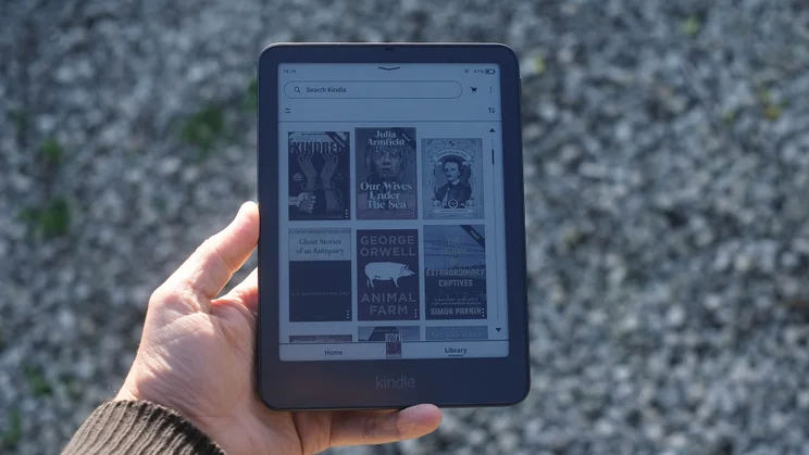
By keeping the Kindle interface completely intact in the transition from Paperwhite to Colorsoft, those upgrading for the first time get the neat experience of seeing a familiar homepage, but now with colour book covers. It’s quite the moment if you’ve used a monochrome Kindle for years.
The software layout, core features, all remain pretty much the same. One important difference is the Colorsoft supports colour highlighting, in five different tones. You can then search through these later on, by colour. It’s more impactful in the Scribe series, but there are plenty of people who highlight and annotate novels without a stylus.
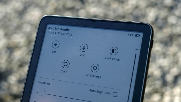
Light, warmth and brightness
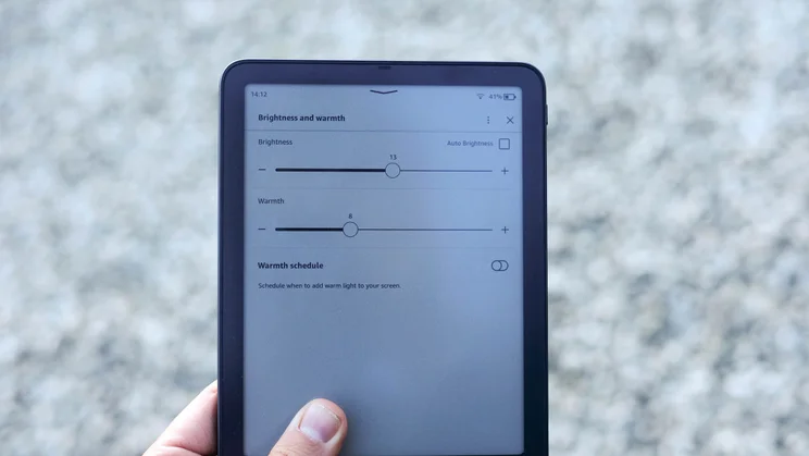
The Kindle Colorsoft also provides greater control over the colour temperature of the front light than other models. I had the chance to put the Colorsoft up against the Paperwhite, standard Kindle and classic Oasis, and found it gets far more blue (cool) and more orange (warm) at the extremes of the range.
I tend to keep a Kindle’s screen light at a fairly neutral temperature, but the added control should appeal to blue light haters; getting too much blue light before bed can make it harder to get to sleep.
Amazon offsets the tendency for cooler light to be perceived as brighter by making the Colorsoft’s front light output higher when at the warm end of the scale. It reaches 139 nits at 100% “warmth,” or 127 nits at its coolest setting. The light looks consistent across the screen’s surface, which was backed up by the fact my colorimeter only measured disparities of a few nits. All good stuff.
Sharpness and contrast
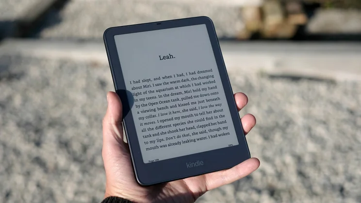
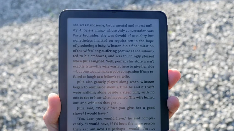
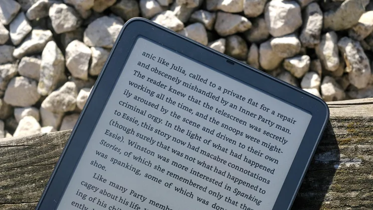
While I am going to criticise the Kindle Colorsoft screen shortly, its text sharpness is also very solid. The Colorsoft’s E Ink display has 300ppi black and white resolution, just like a Paperwhite. And while I prefer non-colour ereaders for reading novels, particularly indoors during day-time, the Colorsoft is still miles better than a phone for reading.
You can use it just about everywhere too, thanks to the IPX8 water resistance. Just be careful about keeping sand and other scratchy stuff away from the display itself.
As in the last generation, Amazon rates the Colorsoft’s battery life at eight weeks, based on half an hour of reading a day at mid-level display brightness and Wi-Fi switched off. This isn’t as long as the Paperwhite’s 12-week battery life, but only the most voracious of readers will need to charge this reader anything like as regularly as their other gadgets.
Amazon’s own claim suggests it should last the equivalent of 28 hours of reading. That’s consistent with my non-scientific testing of seeing how much the battery drains in 45-minute reading sessions. Sometimes you lose a percent of charge, sometimes not, and sometimes you see the battery drop a while after you’ve finished reading.
Is there anything negative to be aware of?
The 2026 Amazon Kindle Colorsoft has basically the same panel as the 2024 original. And this comes with some limitations you need to know about before you buy one.
Number one: colour depth and pop. Amazon’s own product page offers a pretty optimistic view on how the colour comes across in person, at one point directly comparing it to a phone screen — that’s not helping anyone. In reality, it’s muted, and a Colorsoft can’t properly relay fine gradients as the colour palette is limited to 4,096 tones.
I’ve long since made peace with this as someone who has used a number of colour e-readers. It’s just how colour looks in this generation of E Ink. Kaleido 4 is coming, with improved contrast, 40,000 distinct tones and a claimed doubling of colour volume. That’s one for the future, and I do recommend trying to see a Kindle Colorsoft in person before buying to avoid potential disappointment.
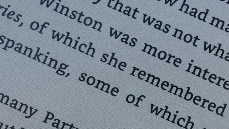
What bugs me more is the colour Kindles’ lower contrast, thanks to the greyer appearance of the screen’s “blank” page. Get really close and you’ll see what look like tiny, fine diagonal lines across the panel. They are present because the colour reproduction requires an extra filter layer. Look even closer with a macro camera lens and you’ll see the tiny red, green and blue “subpixels” of this filter, whose slanted roll-out leads to those perceived diagonal lines.
The result is that, whenever you’re indoors, you need to rely on the front light to make your book readable. I always use some level of reading light, regardless of which e-reader I use these days, but there’s no denying the screens on the base Kindle and Paperwhite are better for reading good old monochrome novels.
In fact, I think the Colorsoft’s 7in screen is also a bit too small to comfortably relay the average adult-geared graphic novel without zooming into the panels. I think many would actually prefer a 10in to 12in LCD or OLED tablet for this job.
This generation also brings nothing major new beyond the tweaked design and accessories. There’s no stylus support or more advanced note-taking features, and (to no-one’s surprise) no opening up of the platform to support library book lending in the UK, although you can of course still send your own files to the e-reader via email.
I would also love to see Amazon make a return to a textured glass screen rather than the plastic used here, in the Paperwhite and base Kindle. Amazon used textured glass back in the day with the Voyage and Oasis, but both are still long gone. Why? My years-old Oasis screen looks absolutely pristine, but I’ve scratched plastic screened e-readers several times in the interim.
Should you buy the Amazon Kindle Colorsoft (2026)?
The 2026 Amazon Kindle Colorsoft is still good, but ultimately it makes fairly subtle changes to the 2024 original.
Amazon’s Signature Editions get a bit more weight, with aluminium casings, as well as extra features. And whatever model you get, it’s substantially slimmer than last time around. The optional page button case is neat, too.
Fundamentally, though, the core experience is as before. There’s a real thrill to seeing book covers in colour for long-term Kindle users, but it’s important to have realistic expectations of colour depth and fidelity. There’s no significant improvement on that front this time.


